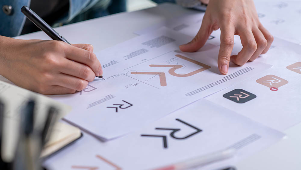
#logo-design
#logo-design
[ follow ]
#branding #rebranding #graphic-design #brand-identity #typography #electric-vehicles #visual-identity

#branding


Typography
fromItsnicethat
6 months agoProject 3 Agency rebrands the ArtScience Museum, around the concept of convergence
ArtScience Museum's visual identity centers on convergence through intersections, overlays, and dynamic forms, with distinctive typography, a lotus-inspired 3D logo, and a layered colour system.
Marketing
fromLondon Business News | Londonlovesbusiness.com
6 months agoThe element of distinction: Isolating your brand in a crowded market - London Business News | Londonlovesbusiness.com
A professional logo on chemical packaging establishes trust, signals technical competence, and creates immediate market recognition for suppliers and buyers.

fromFast Company
2 months agoThe Getty's new logo is a blocky tribute to its vast collections
We needed a visual identity that was uniquely Getty and distinct enough to unify how we show up globally. This system gives Getty one clear, ownable expression in support of the work we do around the world.
Typography
fromEntrepreneur
3 months agoHow to Design a Logo That Lasts 10+ Years
Creating a logo for your business takes tremendous planning, research and thorough execution. Your logo is a lifelong part of your business, so make sure it represents you well. Whether you are hiring a professional creative agency or you decide to do it yourself, I want to shed some light on a few central elements to this process. The key to a great logo is to create something timeless.
Typography
fromBusiness Insider
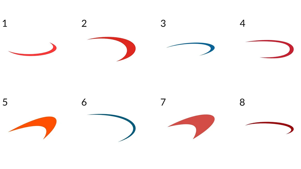
3 months agoTesla filings reveal possible new Roadster logos
Tesla is only a few months away from its planned Roadster demo, and it might be getting a fresh new logo to boot. The automaker filed two new trademark applications on Tuesday with the United States Patent and Trademark Office. One of the filings shows a sleek design featuring three minimalist lines that appear to form a vehicle. The second application is for the styling of the name. The company submitted protections for "Roadster" in an all-caps styling with a stretched shape and segmented letters.
Cars
fromDefector
6 months agoThe Phoenix Mercury's New Logos Vs. The Planet Mercury: An Exhausting Showdown | Defector
The Phoenix Mercury have one of the best nicknames in sports. It's classical, referring to the Roman god of, among other things, travel, trickery, and luck. It's local, referring to fact that Phoenix is a monument to man's arrogance. And it is scientific, referring to one of our solar system's weirdest and most interesting planets. But until now they had a deeply unserious logo that screamed Googie by way of 1990s kitsch.
Typography
fromFast Company
8 months agoBMW's new rebrand is so quiet you might miss it
BMW just made a subtle change to the logo on its latest car. The German automaker simplified the roundel on its new, fully electric BMW iX3 by removing the inner outlines of the logo. Most people won't even notice. So why bother? As luxury automakers adapt to an electric future, they're updating their branding too, and different companies have taken different approaches.
Cars

fromCreative Bloq
10 months agoIs this REALLY how TripAdvisor chose to reveal its new logo?
Tripadvisor's new identity is built to showcase travel as it really is: personal, textured, emotional. The logo brings new life to Tripadvisor's iconic owl mascot, Ollie. Once static and ornamental, Ollie now feels alert and expressive, his gaze always oriented toward traveler content, a quiet cue that Tripadvisor values their perspective.
Marketing
[ Load more ]