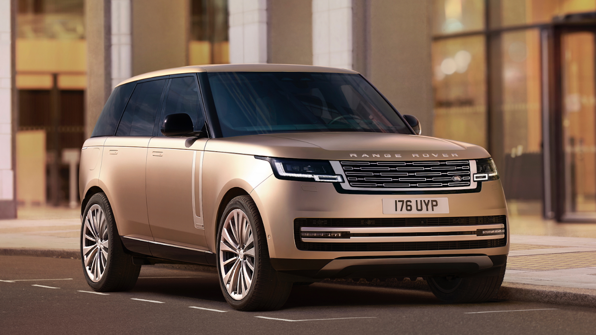
"The new Range Rover emblem, with its intertwined 'R's, marks a significant aesthetic departure in the brand's 55-year history, aiming for versatility but drawing mixed reactions."
"Critics have likened the new Range Rover logo to other non-automotive brands, believing it deviates too far from the traditional luxury SUV identity and heritage."
Jaguar Land Rover unveiled a new emblem for Range Rover amid public backlash surrounding Jaguar's recent rebranding. The emblem, featuring two interlocking 'R's, is designed for smaller applications where the familiar logo may not fit. While this new design aims to modernize the brand, it has garnered criticism for not resembling traditional automotive branding. Observers have noted its resemblance to logos from other industries, raising concerns about whether it effectively represents Range Rover's luxury heritage and identity.
Read at Creative Bloq
Unable to calculate read time
Collection
[
|
...
]