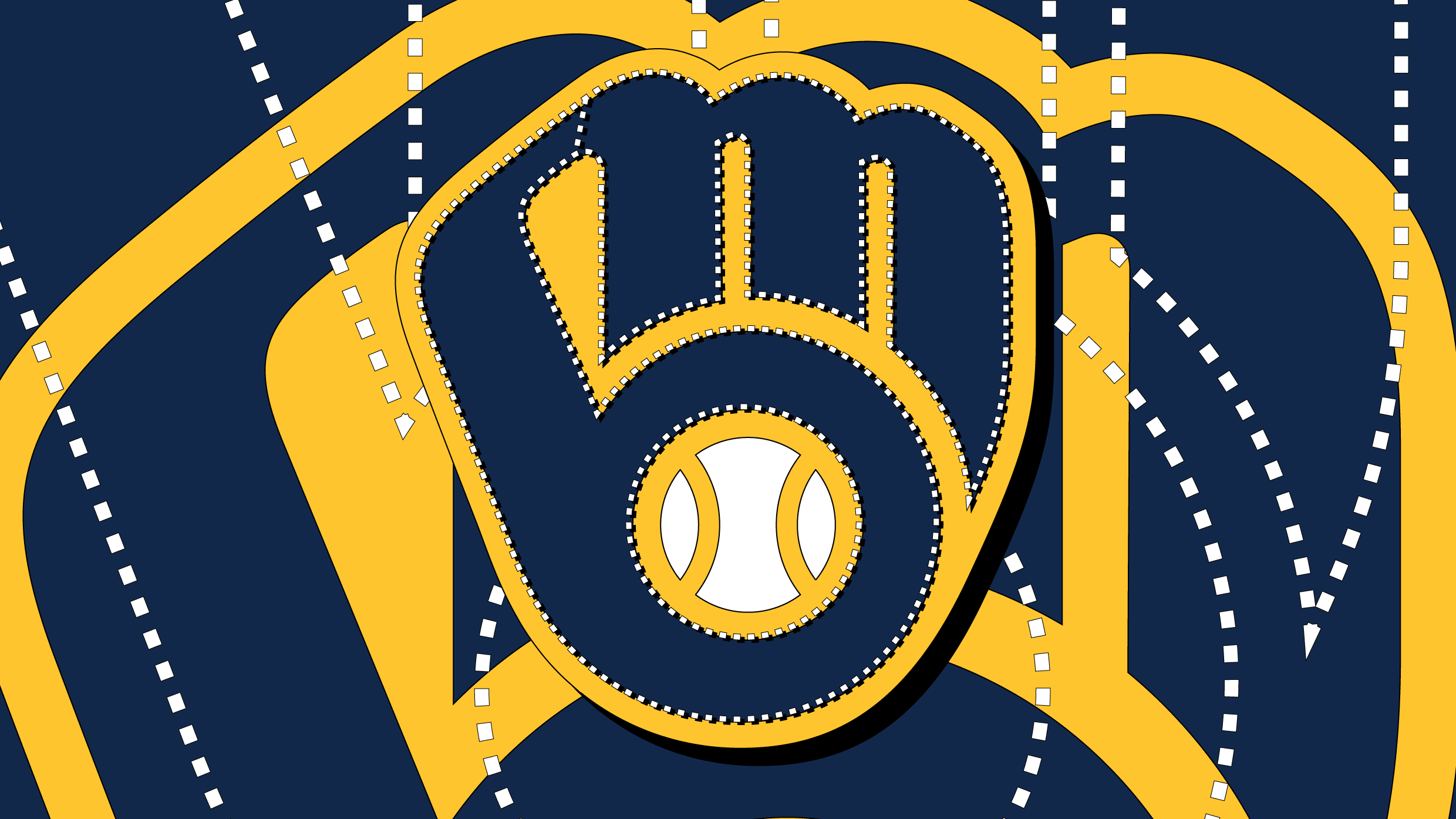
""It's a concept by Tom Meindel, a former art history student at the University of Wisconsin-Eau Claire who submitted the design to a team logo contest.""
""The Brewers revived his classic ball-in-glove logo for their 50th anniversary is a testament to the logo's simplicity and proof that nostalgia sells in sports.""
""I had actually been in the organization for probably five years before I figured it out," right fielder Ryan Braun admitted in 2019."
""How old were you when you realized the glove is also an 'm' and a 'b'?" And the responses were 39.1% for 'Always known', 31.4% for 'Far too late in life', and 29.5% for 'Wait. What?!'."
The Milwaukee Brewers' logo, which features a hidden M and B, was highlighted in a Jeopardy clue, illustrating how even longtime fans and players might overlook its clever design. This logo, which was revived for the team’s 50th anniversary, originally emerged from a public contest won by Tom Meindel in 1978. Right fielder Ryan Braun shared that he hadn’t noticed the hidden letters until five years into his career, reflecting the logo’s subtlety. Responses from a fan poll revealed various levels of awareness about the letters, marking the logo's enduring charm and nostalgic appeal in sports identity.
Read at Fast Company
Unable to calculate read time
Collection
[
|
...
]