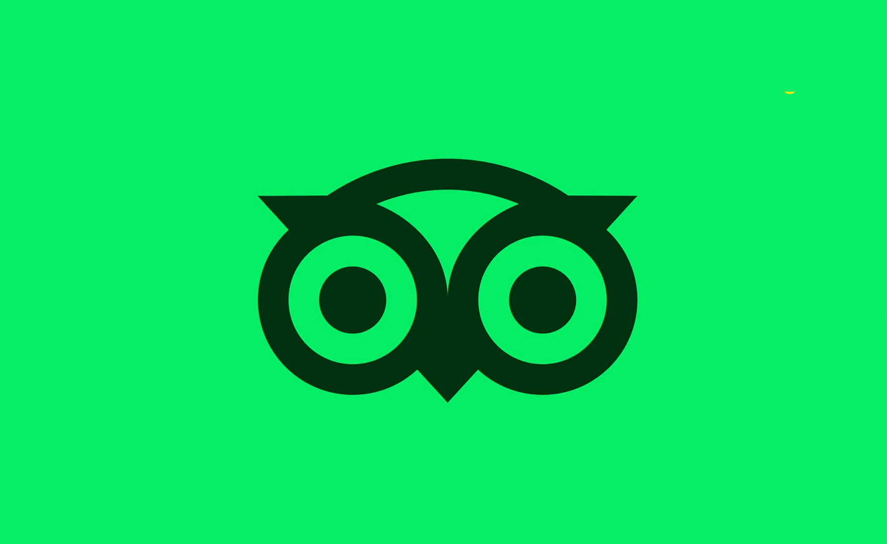
"Tripadvisor's new identity is built to showcase travel as it really is: personal, textured, emotional. The logo brings new life to Tripadvisor's iconic owl mascot, Ollie. Once static and ornamental, Ollie now feels alert and expressive, his gaze always oriented toward traveler content, a quiet cue that Tripadvisor values their perspective."
"The rebrand also features a refined shade of 'TripAdvisor green', which has been refined to feel warmer and more vibrant. Trip Pine replaces black to add depth and reassurance, while Trip White enhances clarity. The secondary palette is drawn directly from traveler photos to make every layout feel grounded, personal, and real."
"Just like the models themselves, TripAdvisor has taken to Instagram to list a series of 'treatments' including rhinoplasty, lip filler and buccal fat removal to explain Ollie the owl's new, fuller face. While it might fly close to the 'obnoxious brand voice' sun, TripAdvisor's 'chronically online' joke just about gets it right."
"When was the last time travel looked this fun, this relatable, this real? Lots of brands claim to be 'authentic,' but more often than not, it feels forced. TripAdvisor's rebrand aims to change that perception."
TripAdvisor has undergone a rebranding effort with designs by Koto, focusing on making travel feel personal, textured, and emotional. The redesigned owl mascot, Ollie, now appears more alert and expressive, symbolizing the brand's connection to traveler content. The rebrand introduces a warmer and more vibrant 'TripAdvisor green', along with other colors derived from traveler photos to enhance the user experience. TripAdvisor playfully announced the changes via Instagram, likening its new logo's enhancements to surgical aesthetic tweaks, attempting to blend humor with authenticity.
Read at Creative Bloq
Unable to calculate read time
Collection
[
|
...
]