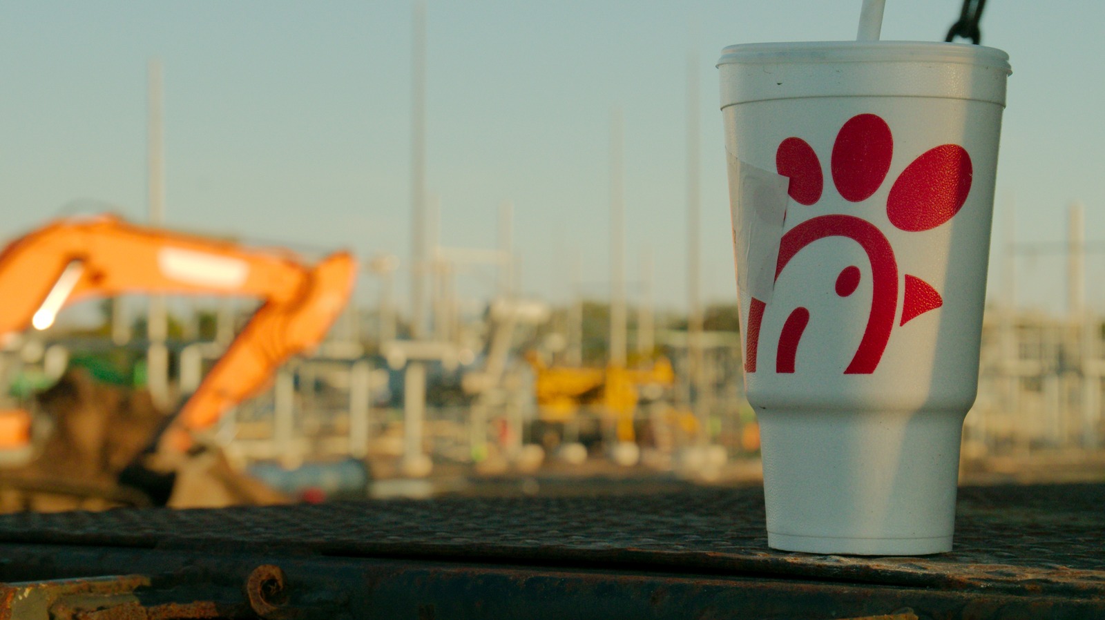
"Today, the chain's presence encompasses more than 3,000 restaurants across the U.S., Canada, and Puerto Rico. But, before it was a global fast-casual giant, Chick-fil-A was a standalone chicken joint in Georgia in 1946, and it didn't even have a logo yet. A logo wouldn't emerge until 1960 - and although it bore the same minimal red and black color palette fans recognize today, the "chicken" character wasn't part of the "C" shape in the restaurant's title."
"Today's fans know Chick-fil-A's "chicken logo" as a stylized letter "C" adorned with a small beak, plume, and eye dot. However, prior to 1960, the Chick-fil-A chicken wore a different, cruder design: A cartoon poultry head with a long, pointed beak. This original mascot wasn't an apparent chicken at all, but a rooster named "Doodles." Per the lore, Doodles was the creative brainchild of American designers Louie Giglio and Evan Armstrong, reportedly commissioned by Chick-fil-A founder and peanut-oil-chicken-sandwich-creator S. Truett Cathy."
Chick-fil-A began as a standalone chicken restaurant in Georgia in 1946 and grew to more than 3,000 restaurants across the U.S., Canada, and Puerto Rico. A formal logo appeared in 1960, featuring a cartoon rooster head called Doodles alongside the name rendered as 'Chick-fill-A.' Designers Louie Giglio and Evan Armstrong created Doodles after a commission by founder S. Truett Cathy. From 1960 to 1963 the logo used the subheading 'Best Thing That Ever Happened To A Chicken.' The second 'L' was dropped from the name in 1964, and Doodles was retired that same year as branding moved toward the modern stylized 'C' chicken mark.
Read at Tasting Table
Unable to calculate read time
Collection
[
|
...
]