"When we think of '80s aesthetics, no design quite embodies the era like the MTV logo. Evolving into a pop culture icon across the decades, the timeless identity has had a lasting legacy in the design world, never losing sight of its retro roots. With news that it is shutting down its five UK channels, we look at its graphic design and how it has evolved to stay relevant."
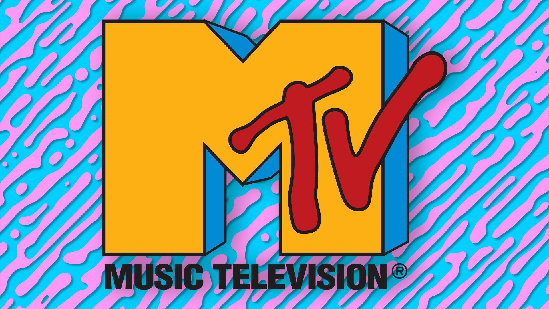
"Teaming up with TV producer Fred Siebert, Viacom executive Rober W. Pittman pitched the concept, and the pair soon enlisted the help of Manhattan Design's Pat Gorman and Frank Olinsky. After vigorous hours of sketching, they found the perfect design - a cartoonish hand holding a musical note - the trouble was, the board of management wasn't a fan. Going back to the drawing board, the team devised a design that incorporated the 'Music Television' namesake,"
MTV launched on August 1, 1981 as the first 24/7 music network aimed at young music fans and required a logo with attitude. Manhattan Design's Pat Gorman and Frank Olinsky collaborated with TV producer Fred Siebert and Viacom executive Robert W. Pittman to develop the identity, iterating past a cartoonish hand concept. The chosen mark paired a striking three‑dimensional 'M' with a graffiti‑inspired 'TV' to balance boldness and playfulness. The logo’s adaptability allowed it to evolve from CD-era graphics to streaming applications while remaining recognisable, even as legacy channels close.
Read at Creative Bloq
Unable to calculate read time
Collection
[
|
...
]