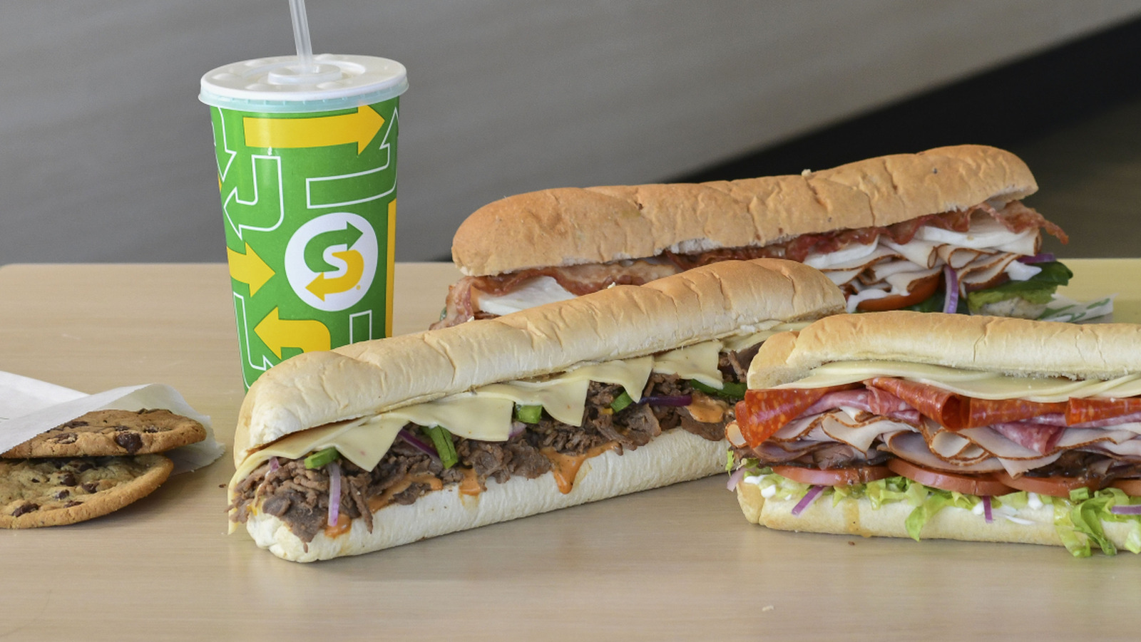
Subway’s logo is a widely recognized visual identity used in more than 100 countries. The first and last letters of the name, S and Y, are elongated into arrow shapes pointing in opposite directions, and these arrowheads have remained since 1970 despite other design changes. One theory says the arrows represent the entrance and exit of a Subway restaurant, matching the quick service assembly-line experience where customers move through the counter and buffet area and leave from the opposite side. Another theory says the arrows evoke subway system signage, supported by a 1976 version using gold text on a black oval similar to MTA line colors. A third theory connects the arrow motion to Subway’s health and active lifestyle branding, including the “Eat Fresh” and “Eat Fresh Refresh” campaigns.
"The first and last letters of the restaurant's name (“S” and “Y”) are stylistically elongated into arrows that point in opposite directions—and there are multiple theories about what, exactly, these arrows represent. Even as Subway's restaurant logo design has changed over the years, the flourished arrowheads bookending its title have remained since 1970."
"According to one popular hypothesis, the arrows symbolize the entrance and exit of a Subway restaurant, a nod to the quick service of the chain's assembly line structure. Guests approach the counter, move down the glass-windowed buffet as their sandwich is systematically assembled, then exit the store from the opposite side of the line."
"Alternatively, another theory maintains that the logo's arrows are meant to evoke the signage of an actual subway system—a public transit motif that also ostensibly captures the fast food sandwich chain's efficiency and speed. In 1976, Subway's logo was even depicted in gold text against a black oval-shaped badge, a color palette that New Yorkers might subconsciously recognize from the MTA's signage for the N, Q, and R subway lines."
"A third theory posits that the action-forward arrow shape is a continuation of Subway's health-conscious, “active lifestyle” rebrand of the chain. Indeed, Subway has long marketed its fresh sandwich ingredients as a healthier alternative to other fast food options, even using the slogan “Eat Fresh” from 2000 to 2015, then picking up the “Eat Fresh Refresh” initiative in 2021—a campaign which is still ongoing."
Read at Tasting Table
Unable to calculate read time
Collection
[
|
...
]