"The New York-born coffee chain Blank Street is rolling out a comprehensive rebrand, including a new range of green colors and a new logo that prominently features a literal blank space. The company founded by former venture capital co-workers Vinay Menda and Issam Freiha with a single Brooklyn coffee cart in 2020 has since swelled to some 90 locations across New York, Boston, Washington D.C. and the UK."
"In an announcement shared with DCN, Blank Street Global Creative Director Mohammad Rabaa emphasized that the rebranding is somewhat subtle while also being comprehensive, affecting store design, packaging and menus. "This transformation was not about doing a 180, it was about becoming more ourselves," Rabaa said. "Our brand is built on tensions - function and form, utility and indulgence, sophistication and playfulness - and you'll see these explored more critically through this new brand identity.""
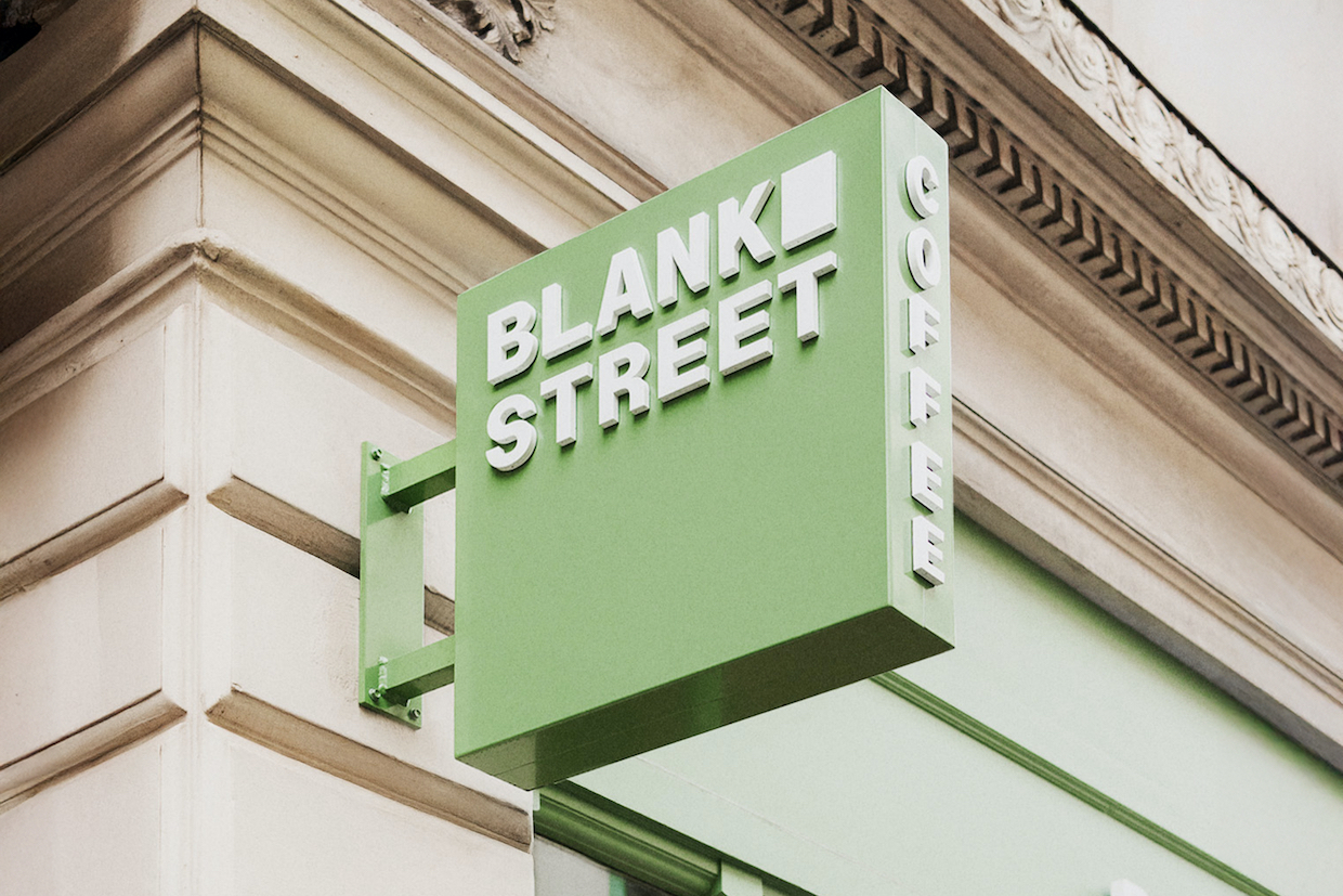
"Blank Street's original signature mint/seafoam green is being replaced by a somewhat darker Blank Street green, plus a secondary palette of greens that reference how light hits the green at different times of day. The original Blank Street wordmark - as found on storefronts, cups and bags - has been reworked as a monospaced lockup featuring customized typography that employs Regular Sans (primary) and Remarkable Sans (secondary). Separating the words in the new logo is a vertical rectangle, described as both a blank space and as a window, referencing the company's original cart. According to the firm Wolff Olins, which led the design, the symbol serves as a "visual cue for imagination and possibility.""
Blank Street implemented a comprehensive rebrand that updates store design, packaging, menus, and visual identity. The rebrand replaces the original mint/seafoam green with a darker Blank Street green and a secondary palette that reflects changing light. The wordmark has been reworked into a monospaced lockup using customized typography with Regular Sans as primary and Remarkable Sans as secondary. The new logo separates the words with a vertical rectangle that functions as a blank space and a window, referencing the company’s original cart. Wolff Olins described the symbol as a visual cue for imagination and possibility.
Read at Daily Coffee News by Roast Magazine
Unable to calculate read time
Collection
[
|
...
]