"The Ford logo, an iconic emblem from the early 1900s, has remained largely unchanged since the late 1920s, embodying heritage and reliability."
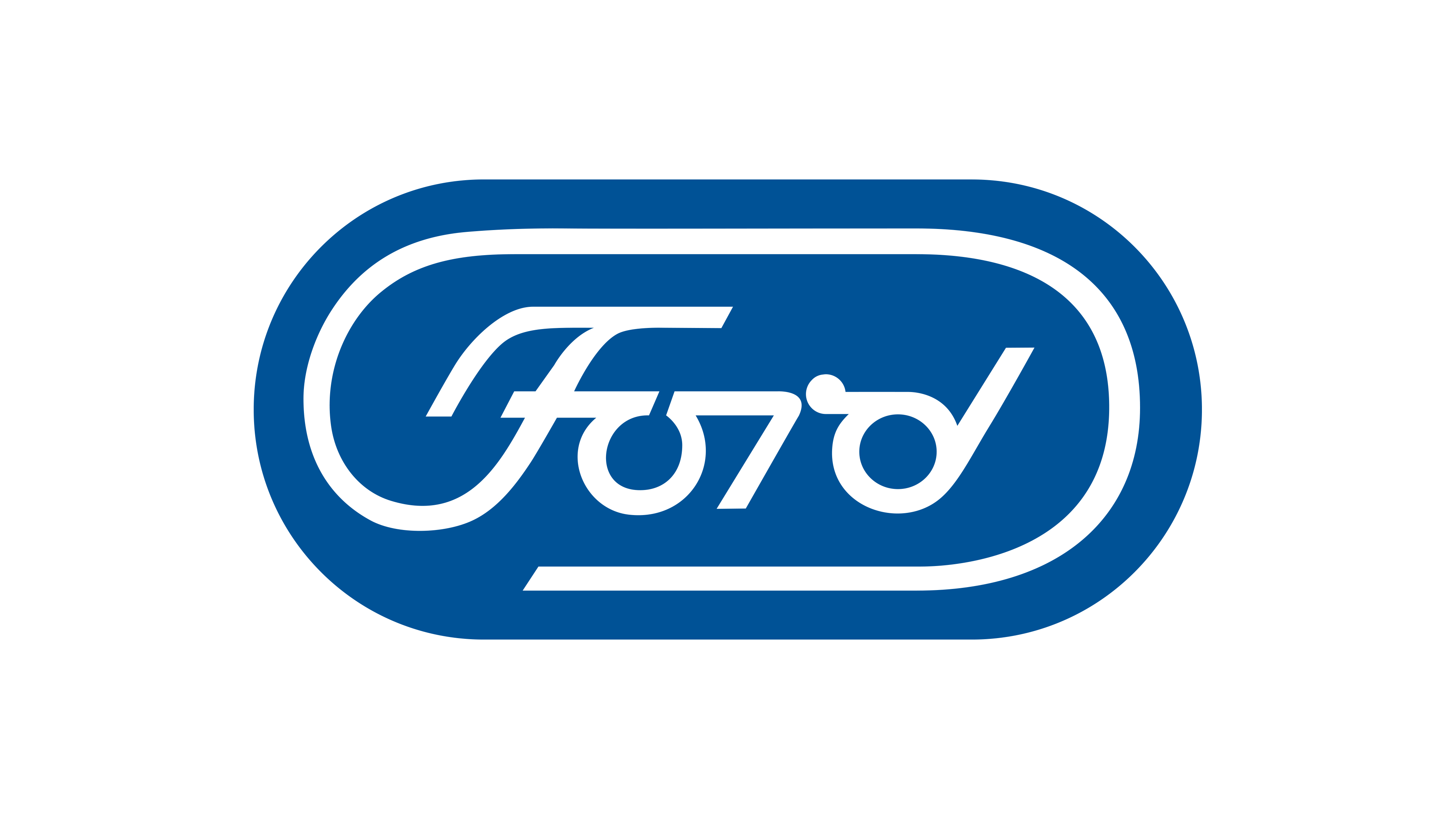
"Paul Rand created an alternative Ford logo in 1966, modernizing the design by replacing the cursive typeface with a unique graphic font in a rounded shape."
"Rand's sleek logo concept was rejected, leaving the current design untouched since 2003, creating a call for modern updates to the iconic emblem."
"Despite being a powerful representation of the brand, the Ford logo hasn't seen an update, suggesting a timely reinvention is overdue."
The Ford logo, established in the early 1900s, has seen little change since the late 1920s. It stands as a symbol of heritage and reliability, remaining unchanged since 2003. In 1966, designer Paul Rand proposed an alternative logo that modernized its look while retaining the blue and white color scheme. This concept design featured a unique graphic font and a more rounded shape. Despite its potential, Rand's design was rejected, leading to a call for a reimagining of the logo to honor its legacy and spur creative inspiration.
Read at Creative Bloq
Unable to calculate read time
Collection
[
|
...
]