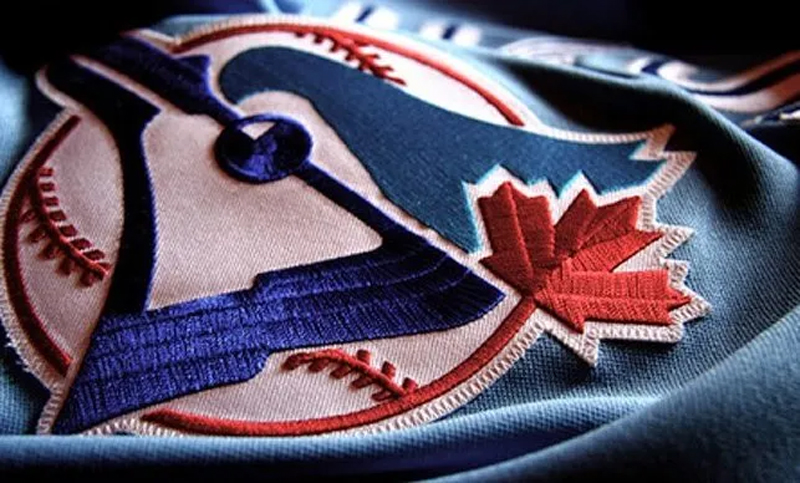
"One of Canada's most well-travelled birds is the humble blue jay. It may not be the official fowl of the country - that distinction belongs to its cousin, the gray jay - but the Blue Jay is the patron saint for "Canada's team": the Toronto Blue Jays. Due to the recent resurgence of the club, the Blue Jays are more popular now than they've ever been. The Blue Jays logo is plastered on caps, jerseys, apparel, and any other merchandise you can think of."
"As 45 percent stake owners in the club, Labatt Brewing Company took the lead role in marketing the ball club, and that began with the most prominent building block: a team name and a logo. The person who oversaw this task? Richard Walker. In the late 1960s, Walker worked at Stewart Morrison, the firm responsible for designing the iconic Montreal Expo logo."
"I decided Savage Sloan would be a good firm to do the design. I set up the parameters of what I wanted from my knowledge of sports logos and colours. I insisted the logo had to be in a circle, because a baseball is a circle. I figured red, white and blue would be good colours because they're used globally, and blue was a good colour for Toronto."
The blue jay serves as the emblem for Toronto's Major League Baseball team and has become highly visible on caps, jerseys and other merchandise. Labatt Brewing Company, holding a 45 percent stake in the franchise, led marketing efforts and prioritized establishing a team name and logo in the mid-1970s. Richard Walker oversaw the logo creation after joining Labatt, bringing experience from Stewart Morrison and the Montreal Expo logo. Walker selected the firm Savage Sloan, specified a circular motif to echo a baseball, and chose red, white and blue with an emphasis on blue for Toronto and Labatt.
Read at Blue Jay Hunter
Unable to calculate read time
Collection
[
|
...
]