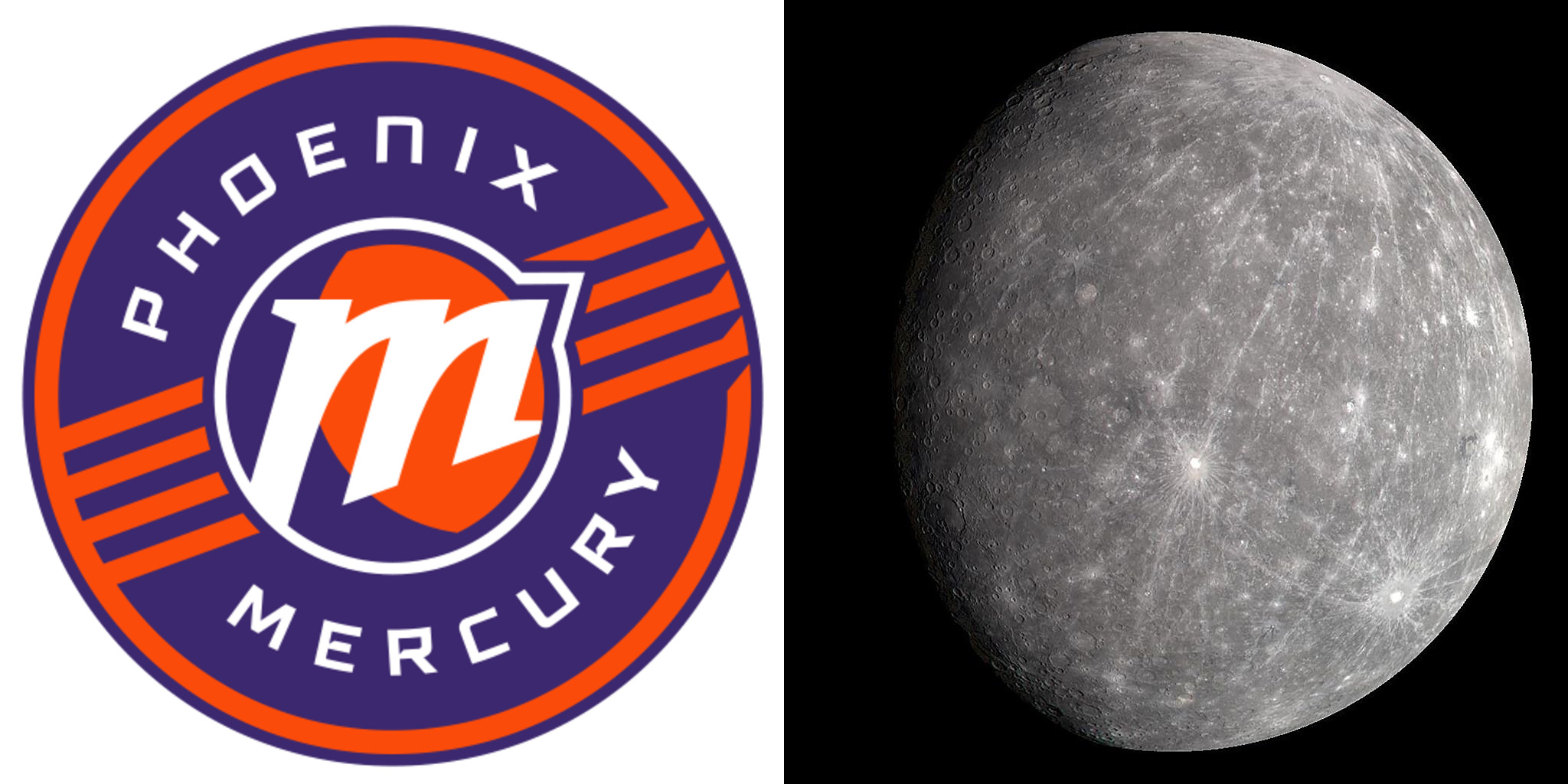
"The Phoenix Mercury have one of the best nicknames in sports. It's classical, referring to the Roman god of, among other things, travel, trickery, and luck. It's local, referring to fact that Phoenix is a monument to man's arrogance. And it is scientific, referring to one of our solar system's weirdest and most interesting planets. But until now they had a deeply unserious logo that screamed Googie by way of 1990s kitsch."
"The Mercury say they did not engage an outside design firm to produce their new logos. But they do claim the process took nearly three years, which is billable hours-coded, and they do suffer the same need to logorrheically explain every choice, and assign deep lore to every decision, as if a sports logo is a Dan Brown puzzle to decode and not a thing that mostly just needs to look cool on merch."
The Phoenix Mercury nickname combines classical, local, and scientific references through Roman mythology, city context, and the planet Mercury. The team previously used a playful, Googie-influenced logo that relied on 1990s nostalgia. New marks abandon jet-age motifs and ban any spaceship imagery, adopting a professional, modern aesthetic. The design process reportedly spanned nearly three years without an outside firm, yet it produced detailed, lore-driven explanations for every element. The new graphics label stacked elements as "planetary rings," despite real planetary rings being concentric and Mercury having no rings, creating an inaccurate planetary reference.
Read at Defector
Unable to calculate read time
Collection
[
|
...
]