#packaging-design

[ follow ]
fromFood & Beverage Magazine
2 days ago

Toho International and Pabst Blue Ribbon Unveil Monster Collaboration Featuring Godzilla - Food & Beverage Magazine

The King of the Monsters is about to invade American coolers in the most epic way possible. Pabst Blue Ribbon and Toho International have joined forces for what might be the most talked-about beverage collaboration of the year - putting Godzilla's iconic image on over 60 million PBR cans and boxes just in time for the kaiju's 70th birthday celebration.
Food & drink
fromYanko Design - Modern Industrial Design News
6 days ago

Butter Yellow Bose SoundLink Plus packaging turns a speaker into a kitchen staple - Yanko Design

Bose's latest portable speaker isn't just a tech gadget; it arrives in a package that looks like a stick of butter. The design, created by the creative agency Coffee 'n Clothes (CNC), wraps the SoundLink Plus in a soft cream‑colored foil with blue gradient accents that mimic the familiar butter wrapper you'd find in a kitchen pantry. The concept was unveiled alongside the speaker's new "Citrus Yellow" colorway, a shade that has become one of 2025's hottest trends in fashion and tech.
Gadgets
Food & drink
fromFast Company
1 week ago

Aldi just rebranded its private-label products

Aldi is launching its first namesake brand and placing ALDI prominently on private-label packaging to clarify exclusivity and boost brand recognition.
#consumer-behavior
fromWIRED
1 week ago
Marketing

Coke Designed a Plastic Bottle to Sell Us All More Soda

Upsizing a contour Coca-Cola bottle to 20 ounces reshaped consumer expectations and sales while introducing substantial manufacturing and bottling cost challenges.
fromRetail Dive
4 months ago
Graphic design

Does your brand communications strategy include packaging?

Packaging should connect with consumer interests rather than demographics.
Emotional appeal in packaging leads to higher profits.
fromCreative Bloq
2 weeks ago

I love that Starburst's new logo still feels nostalgic

Familiar enough to feel nostalgic, yet dynamic enough to draw in new generations, the revamped look ushers in an exciting new era wrapped in joy. While we might think the best rebrands are about grand reinvention, sometimes a brand refresh is all you need to stand out from the crowd. With a revamped wordmark, expressive typography and a vibrant new colour palette, Starburst's new identity embodies playfulness and personality.
Design
fromFast Company
2 weeks ago

Luxury fragrance has a design problem. Rare Beauty has a fix

Luxury perfume brands have always poured resources into elaborate packaging with bottles shaped like sky-high stilettos, sculpted torsos, or capped with oversize daisies. Yet for all the creativity devoted to packaging, the mechanics have barely evolved. Nearly every alcohol-based perfume still relies on the same one-finger actuator to dispense the fragrance. While this design mechanism has become synonymous with eau de parfum, it also makes the product inaccessible for anyone with limited hand strength or dexterity.
Design
Marketing
fromCreative Bloq
3 weeks ago

These ingenious Heinz ad's have ruined the way I see fries

Heinz's 'Looks Familiar' ads use a French fry box silhouette and signature typography to prove ketchup-fries pairing through logo-less brand recognition.
Music
fromThe New Yorker
3 weeks ago

They'll Take You to the Candy Shop

Twins Adeev and Ezra Potash launched Sweet Stash with Martin Starr, debuting Jams music-note gummies with Ellen Van Dusen-designed packaging.
fromYanko Design - Modern Industrial Design News
1 month ago

Adorable 'Pet Paw' bottle leaves cute pawprints instead of ugly water rings - Yanko Design

Most bottles, cups, glasses, or mugs have a tendency to leave a ring of water/liquid condensate if kept on a surface. It's why we use coasters or table mats, so these rings don't destroy our furniture or leave stains. Except, Michiru's bottle was designed to make those 'stains' desirable. Unlike most bottles that leave rings of water or florets (especially the carbonated bottles), Michiru's Pet Paw Bottle leaves pawprints.
Design
fromCreative Bloq
1 month ago

This vibrant drinks brand is bursting with joyful energy

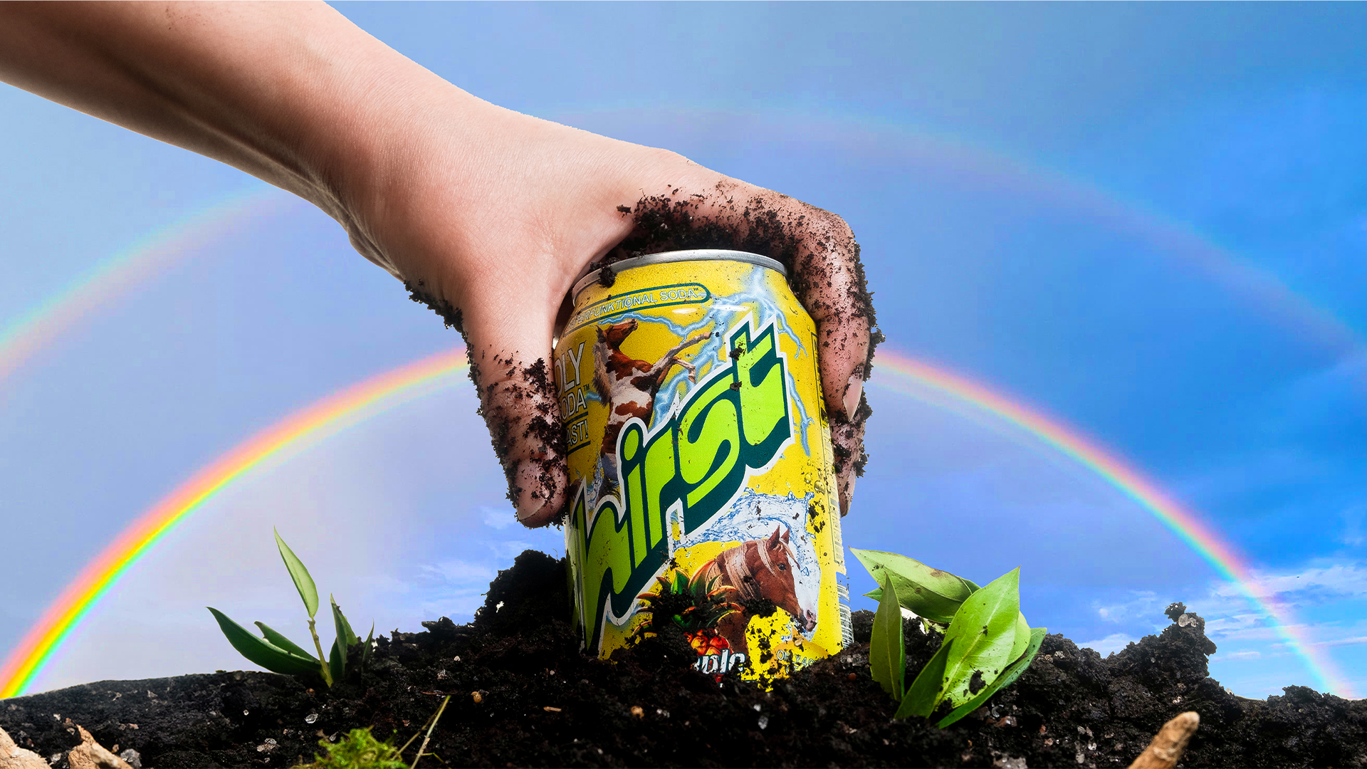
"by pulling visual cues from both and letting them play off each other. From the health side, we leaned into signals of credibility - like clear typography, layered information, and a structured architecture that communicates function without feeling clinical." "From the soda side, we brought in energy and joy - bright color gradients, an expressive wordmark, bold flavor language, and even character illustrations that channel the playful spirit of mainstream soft drinks," he adds.
Design
Graphic design
fromCreative Bloq
1 month ago

Ingenious Bose speaker design taps into 2025's most viral colour trend

Bose released a limited-edition Citrus Yellow SoundLink Plus with toast-inspired, butter-yellow packaging reflecting a major 2025 colour trend.
NYC startup
fromstupidDOPE | Est. 2008
4 months ago

On National Packaging Design Day, Silly Nice Proves Weed Packaging Can Be Sexy and Sustainable | stupidDOPE | Est. 2008

Silly Nice thrives in the competitive New York cannabis market through sustainability, thoughtful design, and a commitment to small-batch quality.
[ Load more ]