"At McDonald's, the meal doesn't begin (as epicures say) at the eyes - at least, not in the traditional sense. Before patrons behold their yellow-paper-wrapped Big Mac, they're laying eyes on Mickey D's iconic Golden Arches. Graphic design communicates identity, and to that end, McDonald's has emerged as arguably the most recognizable fast-food branding in the world - and it's no contest. Whether Ronald McDonald himself is at the forefront or not, everyone knows McDonald's."
"In the '80s, burgers came in their own Styrofoam boxes. Several of the 14 vintage McDonald's Happy Meal boxes that we still remember decades later featured large, hard-plastic food boxes shaped like boats and train cars. While the packaging for 1982's McDonaldland Express and 1983's Ship Shape promotions might have been "collectible," many of those plastic meal containers likely ended up in landfills. Enter: Mickey D's shift toward sustainability."
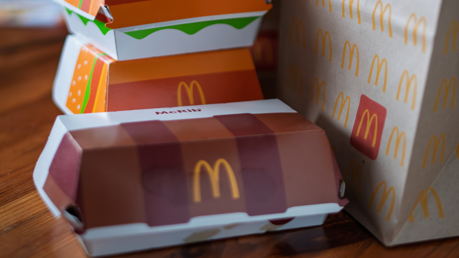
McDonald's branding centers on the Golden Arches as a global identifier. Graphic design communicates corporate identity, making McDonald's arguably the most recognizable fast-food brand worldwide. The logo and packaging have changed over decades while preserving core recognition. The 1960s introduced the Golden Arches as a defining symbol. The 1980s saw novelty plastic and Styrofoam containers, including hard-plastic Happy Meal boxes shaped like boats and train cars, many of which became landfill waste. Promotional items from 1982 and 1983, like McDonaldland Express and Ship Shape, were marketed as collectibles despite environmental consequences. The 1990s brought a shift toward eco-friendly materials, replacing Styrofoam cups and the yellow "Big Breakfast" boxes.
Read at Tasting Table
Unable to calculate read time
Collection
[
|
...
]