"In the competitive world of retail, every detail counts. While product quality is paramount, one of the most powerful levers you have to attract attention, build trust, and drive sales is your retail labelling. The label is often the first interaction a customer has with your product - the thing they see, read, touch. An eye-catching label from CDM Labels can turn a glance into a purchase, while a dull or confusing one can leave your product overlooked."
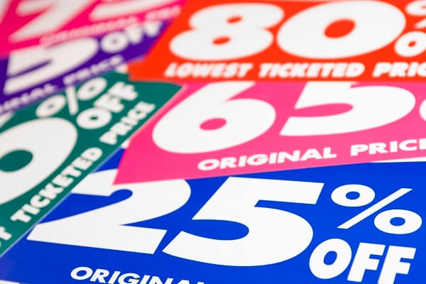
"Colour & Visual Contrast Strong contrast between text and background improves visibility and legibility. Colour choices should reflect your brand identity but also help the product stand out. Simplicity & Clean Design Less is often more. Avoid clutter. Essential information should be immediately visible, with secondary details less prominent. White space (or "negative space") allows the design to breathe and helps focus attention. Readability Font choice and size matter. Sans-serif fonts are often easier to read at small sizes. Text should be legible even from a slight distance or small thumbnails (for online)."
Retail labels act as primary customer touchpoints that attract attention, convey brand identity, and influence purchase decisions. Effective labels prioritize clear branding and logo prominence, strong colour contrast for legibility, and a simple, uncluttered layout using ample white space. Readability depends on appropriate font choice, size, spacing, and contrast, with sans-serif fonts favored at small sizes. Shape, size, and material choices—such as die-cuts, rounded corners, and distinctive substrates—help products stand out and communicate quality. Compliance with regulations and careful production choices ensure labels are both appealing and functional on shelf and online.
Read at London Business News | Londonlovesbusiness.com
Unable to calculate read time
Collection
[
|
...
]