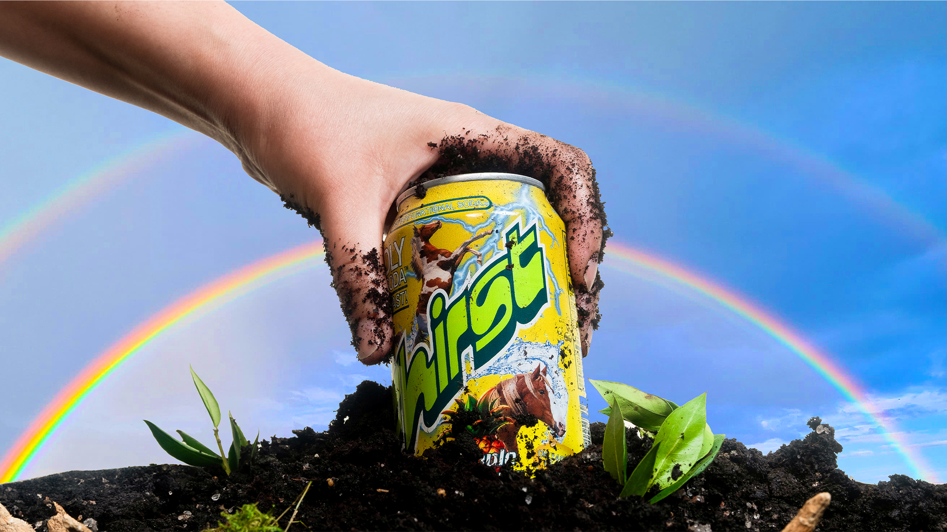
""by pulling visual cues from both and letting them play off each other. From the health side, we leaned into signals of credibility - like clear typography, layered information, and a structured architecture that communicates function without feeling clinical." "From the soda side, we brought in energy and joy - bright color gradients, an expressive wordmark, bold flavor language, and even character illustrations that channel the playful spirit of mainstream soft drinks," he adds."
""The balance comes from not letting one side dominate. Too much "health" and it risks feeling sterile; too much "soda" and it loses its functional edge. By holding both in tension, the identity feels credible enough to trust but vibrant enough to crave - making gut health look less like medicine and more like a treat you actually want to reach for," Mark continues."
A surge in prebiotic drinks has driven many brands toward minimalist, clinical design. Fhirst launches with bold, playful packaging and a lively brand voice to inject fun into the category. The rebrand unites health signals—clear typography, layered information, structured architecture—with soda traits—bright color gradients, an expressive wordmark, bold flavour language, and character illustrations. The design balances credibility and joy so the product reads as both functional and desirable. The outcome positions gut-health drinks as approachable treats rather than medicine, aiming to make consumers want to reach for them.
Read at Creative Bloq
Unable to calculate read time
Collection
[
|
...
]