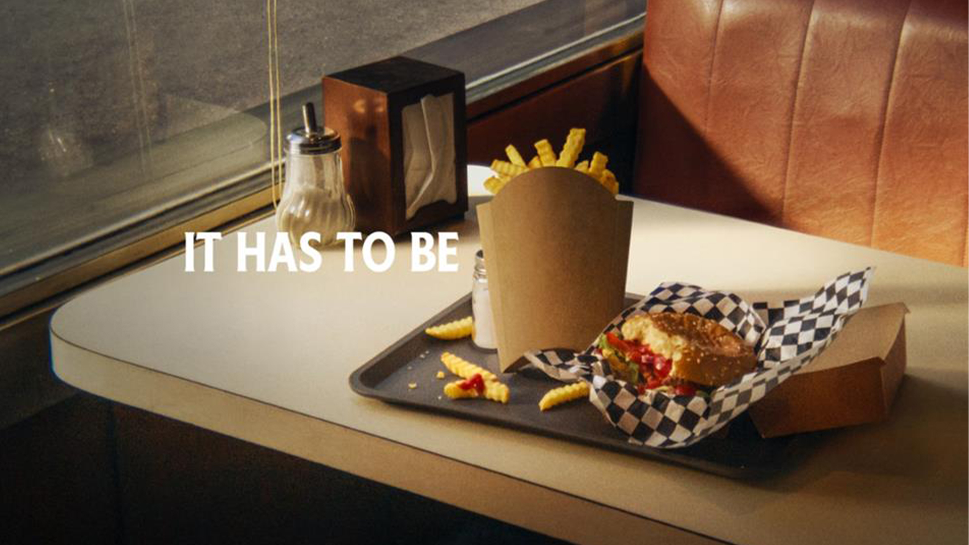
"(Image credit: Heinz) The "Looks Familiar" campaign features various shots of mouthwatering fast food meals. Acting as a visual fill-in-the-blank, the "It has to be" slogan is replaced by a French fry box, highlighting its striking similarities to the iconic Heinz logo. With only a silhouette and its signature typography as identifiers, the ad radiates Heinz's confidence in its brand recognition."
"It might seem like a cardinal sin for a brand to ditch its logo, but it's a trend that we're increasingly seeing in the advertising world (it's not even the first time Heinz has embraced the trend). Turning simple adverts into an interactive guess-who experience, it's a bold and refreshing ad trope that marks a creative invigoration for branding. For more excellent examples of the logo-less trend, take a look at Tesco's logo redesign billboards or check out Kellogg's latest striking campaign."
Heinz's 'Looks Familiar' campaign pairs ketchup and fries by replacing the 'It has to be' slogan with a French fry box silhouette, relying on packaging recognition rather than a logo. The ads feature mouthwatering fast food shots and use signature Heinz typography to signal the brand with minimal elements. The approach emphasizes simplicity and confidence in brand awareness, turning each ad into a visual fill-in-the-blank. Dropping explicit logos follows an emerging trend that makes adverts interactive and playful. Comparable examples include Tesco's logo redesign billboards and Kellogg's recent campaign, illustrating a wider move toward logo-less branding.
Read at Creative Bloq
Unable to calculate read time
Collection
[
|
...
]