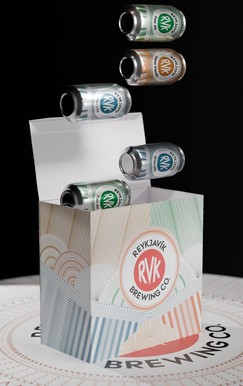
"The renowned Icelandic brewery, Reykjavík Brewing Company (RVK), has been given a bold, contemporary visual identity courtesy of karlssonwilker. The rebranding - from to and merchandise - captures the raw, unique spirit of Iceland's capital, Reykjavík, marrying the brewery's tradition with a fresh, forward-thinking image. karlssonwilker's approach emphasized simplicity and modernity, ensuring that RVK stands out on the shelves while remaining deeply connected to its local heritage."
"Reykjavík Brewing Company's redesign by karlssonwilker blends the brewery's urban roots with the raw beauty of the Icelandic landscape. The new visual identity features striking patterns of RVK, and metallic colors that reflect this duality. By crafting an aesthetic that is both strong and simple, the design studio has created an identity that appeals seamlessly to both local beer enthusiasts and the international audiences drawn to Iceland's distinct culture. The result is a brand that honors tradition while projecting an unmistakable, contemporary confidence."
Reykjavík Brewing Company received a bold, contemporary visual identity crafted by karlssonwilker. The redesign covers logo, packaging, and merchandise, combining urban roots with Iceland's raw landscape. The palette uses metallic colors and striking RVK patterns to convey duality between city and nature. The approach emphasizes simplicity, modernity, and strong shelf presence while maintaining a connection to local heritage. The aesthetic targets both local beer enthusiasts and international audiences attracted to Icelandic culture. The new identity balances tradition with forward-thinking confidence and presents a cohesive, easily recognizable brand across applications.
Read at designboom | architecture & design magazine
Unable to calculate read time
Collection
[
|
...
]