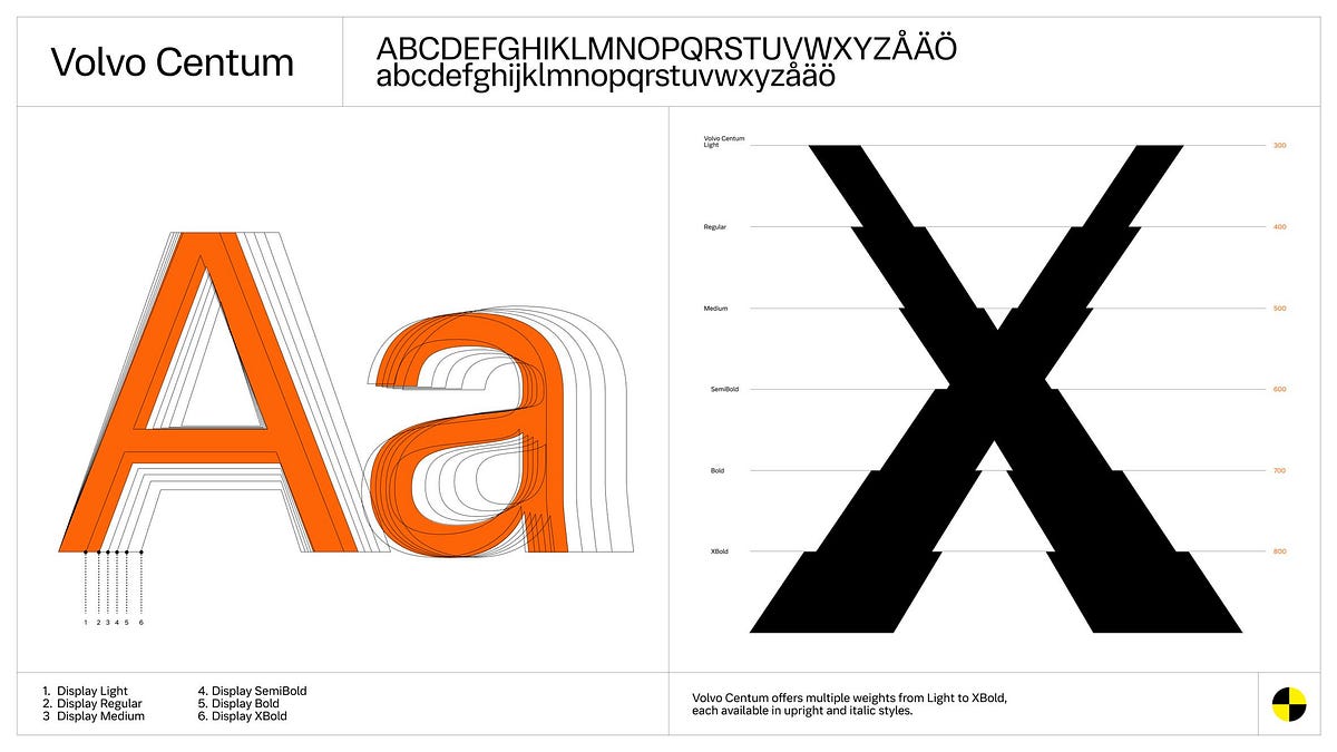
Typography
fromWashington City Paper
15 hours agoUnderstanding How AI Detection Tools Work In Modern Content Writing
AI detection tools analyze text to determine if it is human-written or AI-generated, ensuring clarity and authenticity in content.
While you might know Kagi best as the paid competitor to Google's ever-worsening search product, the company launched its Kagi Translate tool back in 2024, saying at the time that it was a 'simply better' competitor to tools like Google Translate and DeepL. At launch, the company said Kagi Translate 'uses a combination of LLMs, selecting and optimizing the best output for each task,' a fact that 'can occasionally lead to quirks that we're actively working to resolve.'
We present the 5500FP, a 24-trit balanced ternary RISC processor implemented on FPGA, with a 120-instruction ISA, native atomic synchronization primitives, and an open hardware development board. The design demonstrates the practical feasibility of balanced ternary computing on modern reconfigurable hardware, providing a concrete platform for research into non-binary architectures without the barrier of custom silicon development.
I developed the book's grid and typographic style in collaboration with designer David Carroll, then laid out the book myself, focusing on clean design that allows the imagery to breathe. The aim was to create something that feels timeless and functional, rather than overly stylised.
The worst ones are when people have their own name tattooed on them. McGregor's got that actually, Gaethje's got that. I just think it's just weird. Why are you that stupid? Do you need to remember your own name by looking in the mirror?
People kept using the same word - 'iconic' - whether they were thirty, fifty or seventy." The team interviewed staff who'd just joined and staff who'd been there for twenty years, customers since the 80s, locals, online shoppers, and LGBTQIA+ community members, revealing the bookshop's legendary status across generations and demographics.
The corrective fluid analysed using light infrared photography revealed a mixture of huntite and calcite, while images made using a 3D digital microscope show that there also are flecks of yellow orpiment, probably to make it blend in better with the fresh papyrus, which would have originally been pale cream in colour.
The addition of the slash through the zero was intended to help differentiate between the zero and the letter O, which both the license plate readers and human eye have had difficulty differentiating on past registration plates. The diagonal slash was added in accordance with license plate recommendations from the American Association of Motor Vehicle Administrators (AAMVA), a Virginia-based trade group for state and province motor vehicle divisions in the U.S. and Canada.
A sketchnote is exactly what it sounds like: a mixture of sketches and notes to impart information. I love this style because it's both informal (the sketching and hand-written notes) and very formal (it carefully represents data).
The Merriam-Webster editor Peter Sokolowski introduced the crowd of assembled nerds to the idea that a dictionary is not a static document but a living object, constantly updated and remade in response to how people write and speak. In a talk titled "The Dictionary as Data," Sokolowski emphasized that the editors at Merriam-Webster look to how the general public uses language to guide their work.
We needed a visual identity that was uniquely Getty and distinct enough to unify how we show up globally. This system gives Getty one clear, ownable expression in support of the work we do around the world.
Mattel operates dozens of brands under its corporate umbrella, each with their own visual identity and brand voice. But, until now, Mattel has never had its own proprietary typeface for its overarching brand, instead opting to license multiple existing fonts on a global scale—an endeavor that was not only expensive, but also came at the cost of visual consistency across Mattel's many product lines.
"There's a tension in the design of the book that I was exploring, between making it feel super contemporary and colorful, and leaning into more traditional aesthetics of archives and historical content. I wanted to honor both," says Michele. "Copyright law can also be kind of intimidating, so I wanted to use the design of the book to make the content more approachable and engaging."
Justin Bieber for Calvin Klein Spring 2015 Ad Campaign In A Parallel Universe: Artist Exposes Sexism By Switching Up Gender Roles In Old-School Ads Russian Blogger Makes Parodies Out Of Celebrity Photos, And More Than 20,000 Followers On Instagram Approve 10 Famous Movie Titles Written Using Negative Space The World of Modern Graphic Design & Typography by Kyle Kemink Chinese Tech Companies Hiring 'Pretty' Girls to Motivate Male Employees by Chatting, Playing Ping Pong and Buying them Breakfast
A graphic designer that isn't limited to working in 2D, Ward Goes has been working in aluminium of late. His recent solo show in Rotterdam, Literally Anything, was full of things that moved beyond the screen or printed page, including some wonderful metal signage and archival storage. The exhibition at Alley Space was the result of the designer's decision to pursue more tactical investigations alongside his commissioned work at the start of 2025.
If you're based in London, you've probably walked past one of Sean Thomas' meticulously hand-painted designs. Whether that was grabbing a sandwich at Dom's Subs, dining in at Forza Win (an Italian restaurant in Peckham that the designer has shaped the visual identity of over the last three years), or picking up a copy of Hoxton Mini Press' new book on Britain's best bakeries at your local bookshop.
Infused with history, the slab cannot help but suggest the old West's frontier clichés, for such ephemera as classic wanted posters, political broadsides, cautionary warning signs, and more generic commercial applications. Cattivo is a brand-new 18-font family that, when used in any weight and size, cuts through nostalgic predictability and provides a welcome alternative to such popular Egyptian-style slab serifs as Stymie and Memphis.
Vance, a Portland-based journalist who runs Stumptown Savings, a newsletter covering local grocery deals, had been accused of using ChatGPT to write his content. The evidence? His use of em dashes. "A Reddit user accused me of using AI, pointing to my use of, quote, extra long M dashes that are not possible to replicate on a normal keyboard," Vance recalls. The accusation stung, particularly because Vance spends 40 hours a week personally visiting grocery stores and crafting his newsletter by hand.
As time went on, I even started slowing down as I approached this junction to try to catch the offending ad. But even when I got a good look at it, I thought I must be mistaken. Eventually, at 6am one Saturday morning over Christmas, I parked, readied the camera on my phone, and waited. The roads were deathly quiet, neither car nor soul anywhere. Just me, my phone, and this wretched sign.
Our Must-Have Fonts for 2025 list was our most popular ever, but our must-have fonts for 2026 list aims to set the bar even higher. Finding the best typefaces among thousands can be pretty daunting! So, to make things easier, we've curated a list of outstanding must-have typefaces for the coming year. The ten font families in the list share something important in common - an explicitly human touch, not machine-made or prompt-produced, but born from human minds and crafted by human hands.
Blackletter typefaces elicit many contradictory emotions depending, of course, on the context in which they are used and the manner in which they are composed. Sometimes they bark commands - STOP or BEWARE. Other times they are comforting in an ecclesiastical way - Christmas and Easter greetings. During World War II Blackletter was menacing for those in occupied lands who read it as exclusionary - as in FORBIDDEN or DANGER; others accepted it as patriotic
The main problem with the existing homepage was that, besides the most recent posts, other content, once it aged and 'fell off' the front page, was then difficult to discover. The new design makes more use of available screen 'real estate', is visually much richer, and reorganizes 18 years of posts, so that even older long-forgotten posts are more easily found.
Those he saw as "most successful" had a "bold typographic and/or illustrative treatment" which in turn "countered the dominance" of the branding strip that ran down the side. "This realisation led me to define some rules for the designs of the individual covers that tried to ensure that the covers would never feel overwhelmed by the branding system," says Pete. "The core rule was that the Editions would essentially be typographic covers, or typographically-led covers in terms of the hierarchy between type and image."
Monotypes logotype couldn't just exist in one static state - "ideas of diversity, adaptability, and boundary-pushing were central to the creation of the variable logo from the start," says Daniel. Collaborative workshops, sketching sessions and exchanges with Chantelle's global chief creative officer, Renaud Cambuzat, and head of design, Natalia Kotkowska, cemented into the idea for a shapeshifter logo capable of morphing its look through different weights and shapes.