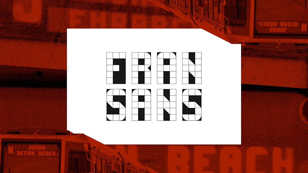
Emily Sneddon lived in San Francisco from 2021 until recently, working at design agency Collins before returning to Australia. She created Fran Sans after observing the display on a retired Muni Metro Breda light rail vehicle. The Bay Area's transit network is governed by multiple independent agencies, so no single official typeface dominates like Helvetica in New York. The project began as documentation of sans typography around the city and evolved into a full font. Sneddon built Fran Sans on a 3×5 grid following months of research, visits to SFMTA facilities, consultation with Gary Wallberg, and study at Letterform Archive.
"Most people don't give the display screens on their commuter trains a second thought, but for designer Emily Sneddon, they've proved to be a well of inspiration. Sneddon lived in San Francisco, where she worked at the design agency Collins, from 2021 until this year when she moved back to her home country of Australia. She designed Fran Sans, her first ever font, after noticing the display on San Francisco Municipal Transportation Agency's (SFMTA) recently retired Muni Metro Breda Light Rail Vehicle."
"Unlike New York City, which handles its public transit through a single agency, the Metropolitan Transportation Authority (MTA), public transportation in San Francisco and the Bay Area is split between multiple independent public agencies, like SFMTA, Bay Area Rapid Transit (BART), and Caltrain, a commuter rail. That means there's no de facto official font for public transportation in the Bay Area as there is in New York City with Helvetica, the official font of the city's unified Metropolitan Transportation Authority (MTA)."
"Sneddon designed Fran Sans on a 3×5 grid after a monthslong research project that included a visit to SFMTA's Electronics Shop at Balboa Park, consultation with Gary Wallberg, a senior engineer who designed the display signs in 1999,"
Read at Fast Company
Unable to calculate read time
Collection
[
|
...
]