Typography
fromCSS-Tricks
3 days agoRevealing Text With CSS letter-spacing | CSS-Tricks
CSS letter-spacing can overlap and then separate characters by animating negative to zero or positive values, enabling per-character-like reveal effects.
With PyCharm 2026.1, users can leverage a comprehensive set of editing and formatting tools for modern web languages, including basic React support with code completion and navigation.
Scroll containers have always been a weak spot in CSS. For years, if you wanted a navigation bar to restyle itself once it became sticky, or a photo to react when it entered the viewport, JavaScript was the only real option. Most of us have written the same pattern: add a scroll listener, call getBoundingClientRect() a few times, flip some classes, and hope the main thread keeps up. It's a lot of machinery for something that should be simple.
There have been a few drafts of a specification function for this functionality, most recently, contrast-color() (formerly color-contrast()) in the CSS Color Module Level 5 draft. But with Safari and Firefox being the only browsers that have implemented it so far, the final version of this functionality is likely still a ways off. There has been a lot of functionality added to CSS in the meantime; enough that I wanted to see whether we could implement it in a cross-browser friendly way today. Here's what I have: color: oklch(from <your color> round(1.21 - L) 0 0);
Stacking contexts are incredibly useful, but they're also widely misunderstood and often mistakenly created, leading to a slew of layout issues that can be tricky to solve. Have you ever set z-index: 99999 on an element in your CSS, and it doesn't come out on top of other elements? A value that large should easily place that element visually on top of anything else, assuming all the different elements are set at either a lower value or not set at all.
The developer community hasn't wasted any time kicking off 2026 with some really great articles, demos, and insights. Firefox 147 and Chrome 144 also shipped, and while they're not jam-packed with features, the releases are still pretty exciting for what's normally a slow time of year, so without further ado, here's what's important from the last couple of weeks (or should I say the first couple of weeks, of 2026?)...
I've recently refreshed the animated graphics on my website with a new theme and a group of pioneering characters, putting into practice plenty of the techniques I shared in this series. A few of my animations change appearance when someone interacts with them or at different times of day. The colours in the graphic atop my blog pages change from morning until night every day.
The site is https://spectrumoutage.org - it works perfectly on Chrome desktop and Android, but when I load it on my iPhone (Safari), the bottom footer seems to float up and cover the last 50px of the content.
Greetings. Can someone please tell me how to get the image on the back of the flip card to fill the card like the image on the front of the card? See attachment with identical image on front and back. I have read the help documentation but did not fine the information needed. Basically, I need the images on the front and back to be the same dimensions. Thank you.
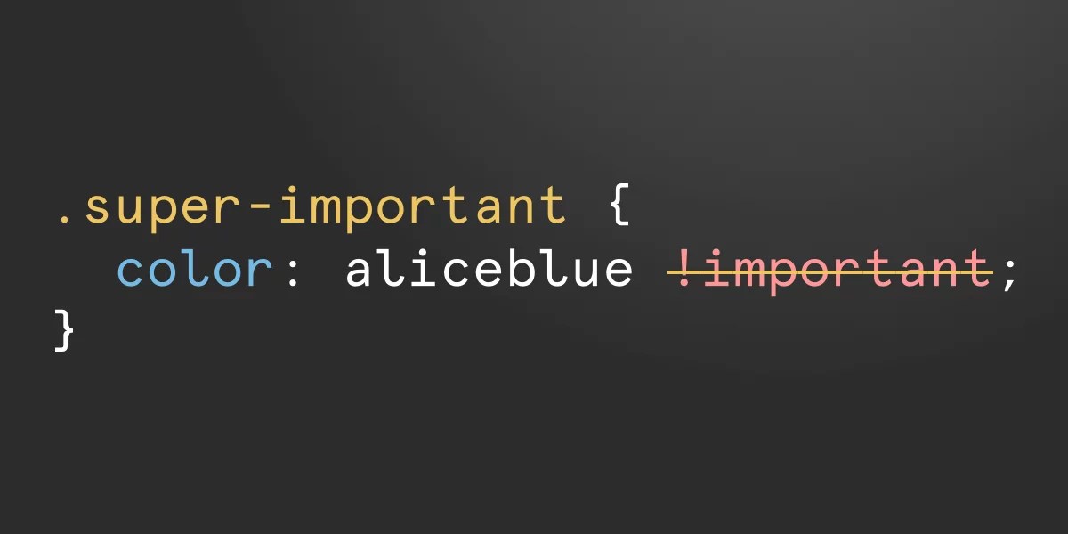
Welcome to the first ever What's !important, a roundup of the best CSS and web development news from the last two weeks. If you're pressed for time (who isn't?) or you just can't stand missing out on anything CSS-related, this is the place to recap: the best CSS/web dev articles from around the web, interesting announcements and quick-read links that we shared, the best of what Chrome, Firefox, and Safari have recently shipped, and more, probably. Let's dig in!
You are for sure wondering what the novelty we are bringing here is, right? It has been done countless times. You are right. The main idea is not complex, but the new thing is the responsive part. We will see how to dynamically adjust the overlap between the images so they can fit inside their container. And we will make some cool animations for it along the way!
In my previous article on colours, I dove into the practical side of the new colour features for developers who primarily copy and paste values from a design file into their editor. With all the new colour features that we have in CSS now, we can do more with colours in the browser than designers can do in their design apps, and it opens up a whole world of possibilities.
The Chrome Dev Team recaps the new CSS features that shipped in Google Chrome this past year in one amazingly designed webpage. They cover new functionality for creating more customizable components, next-gen interactions, and optimizing ergonomics.
text-grow: <fit-target> <fit-method>? <length>?; text-shrink: <fit-target> <fit-method>? <length>?; per-line: For text-grow, lines of text shorter than the container will grow to fit it. For text-shrink, lines of text longer than the container will shrink to fit it. consistent: For text-grow, the shortest line will grow to fit the container while all other lines grow by the same scaling factor. For text-shrink, the longest line will shrink to fit the container while all other lines shrink by the same scaling factor.
CSS Wrapped 2025 is out! We're entering a world where CSS can increasingly handle logic, state, and complex interactions once reserved for JavaScript. It's no longer just about styling documents, but about crafting dynamic, ergonomic, and robust applications with a native toolkit more powerful than ever. Here's an unpacking of the highlights and how they connect to the broader evolution of modern CSS.
Security researcher Lyra Rebane has devised a novel clickjacking attack that relies on Scalable Vector Graphics (SVG) and Cascading Style Sheets (CSS). Rebane demonstrated the technique at BSides Tallinn in October and has now published a summary of her approach. The attack, which has yet to be fully mitigated, relies on the fact that SVG filters can leak information across origins, in violation of the web's same-origin policy.