A universal reduction in letter-spacing can harm readability on the web, especially for small text. Applying a fixed tighter spacing worked in print but proved too aggressive for digital interfaces. A simple threshold approach felt inconsistent when adjacent elements used different spacing. The preferred approach is a gradual transition where letter-spacing decreases smoothly as font-size increases. CSS can compute spacing per element using the universal selector and a calculation that compares 1em to 1rem, reverses direction with a negative divisor, and caps extremes with clamp to maintain usable limits.
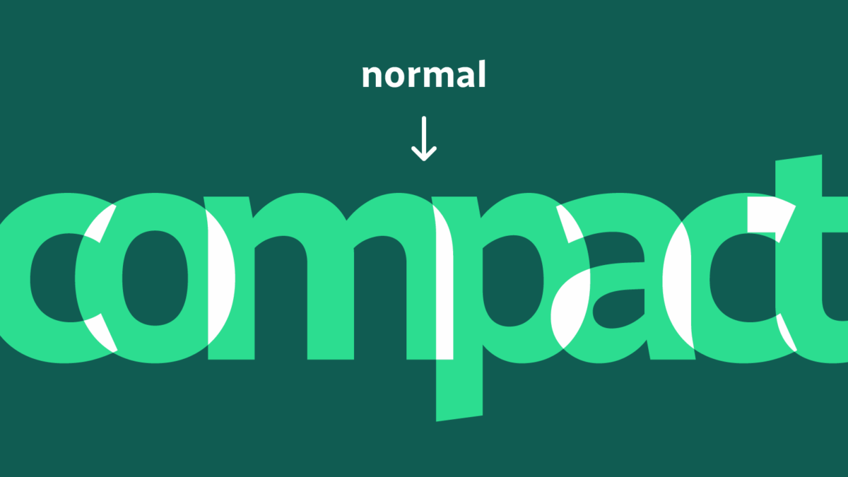
"Earlier this year, a longtime customer shared a new iteration of their brand guidelines. Of particular interest were changes to typography, including heavier weights for headings, and a request to tighten all letter-spacing by a certain percentage. While the latter change worked well in print and certain other applications, it was a bit too aggressive for web and digital. The smaller the text, the more the loss of white space impaired readability:"
"First off, we're using the universal selector, *. This applies the rule to every element, and calculates the value based on each element's unique font-size. (Depending on the project, you may want to constrain this to a handful of specific elements, or fine-tune the specificity using modern techniques like :where or @layer.) Next, let's break down how the letter-spacing is calculated."
"1em represents the current font-size. By contrast, 1rem (note the "r") represents the root font-size. By subtracting one from the other, we get a representation of just how much bigger the text has grown from the default: But that value is in the wrong direction: We want to tighten the letter-spacing, not increase it in lockstep with the font-size. We can divide by a negative number to reverse the direction and slow the rate of change:"
Read at Cloud Four
Unable to calculate read time
Collection
[
|
...
]