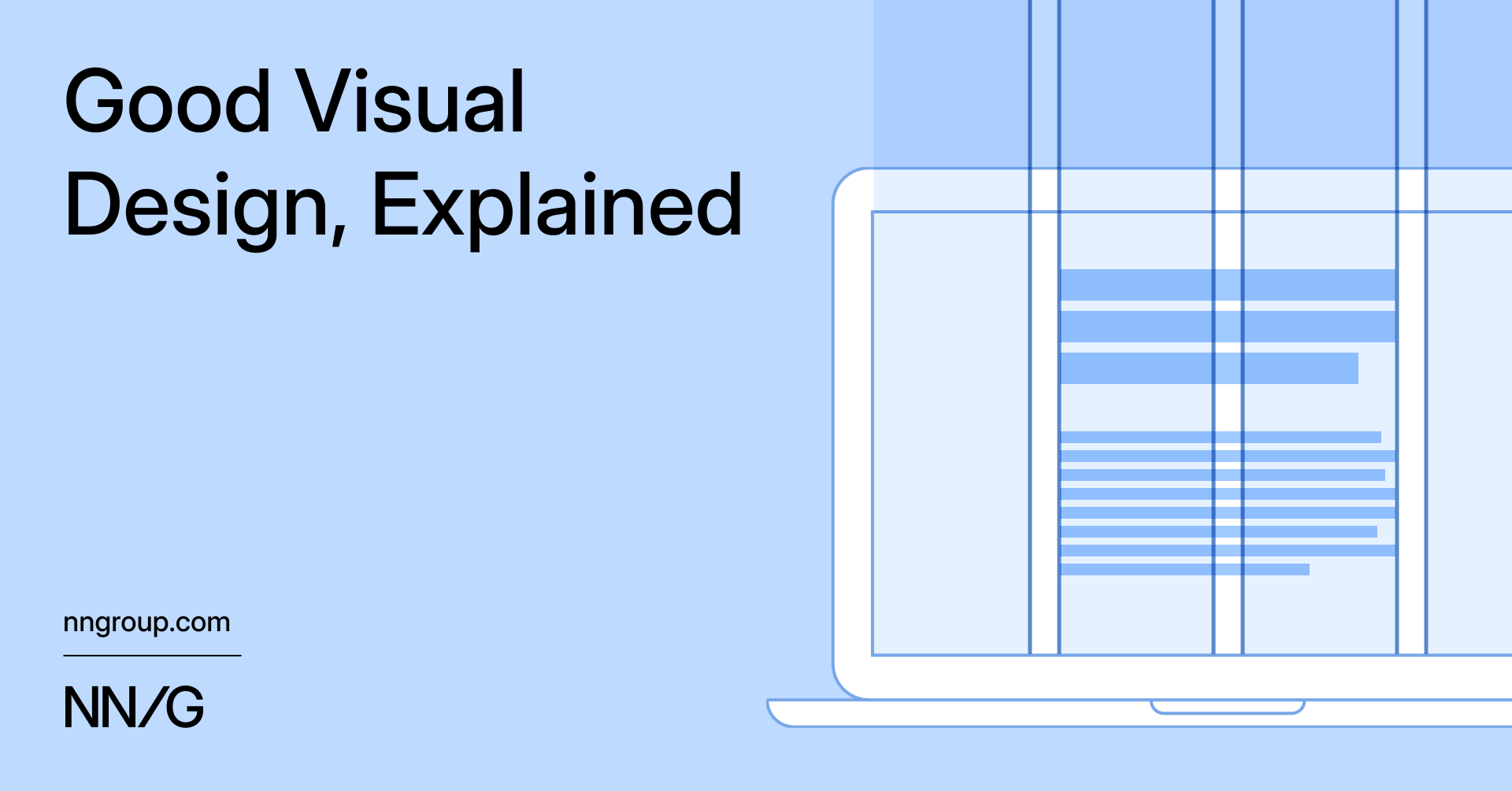
"Grids help designers create cohesive layouts, allowing end users to easily scan interfaces. A good grid adapts to various screen sizes and orientations, ensuring consistency across platforms. Grids are made up of columns with gutters between them. While there is no ideal gutter size, different gutter sizes are suited to different purposes. Example: 3-Column Grid Base with Thin Gutters"
"This page from Figma Shortcut uses a 4-column grid with wide gutters. Text and other elements can span multiple columns, making them appear as one wide column. It's common for content to extend into the gutter when spanning multiple columns. The main body text is aligned to the middle two columns, while extra text (like callouts) is anchored in the left and right columns"
Grids create cohesive layouts that help end users scan interfaces efficiently. A responsive grid adapts to various screen sizes and orientations, maintaining consistency across platforms. Grids consist of columns separated by gutters, and gutter size should be chosen according to purpose. A 3-column grid with thin gutters aligns product images and content to provide a predictable, airy shopping experience. A 4-column grid with wide gutters allows elements to span multiple columns and increases separation between main body text and callouts, improving readability. A typographic system boosts legibility, usability, and the polished feel of a design.
Read at Nielsen Norman Group
Unable to calculate read time
Collection
[
|
...
]