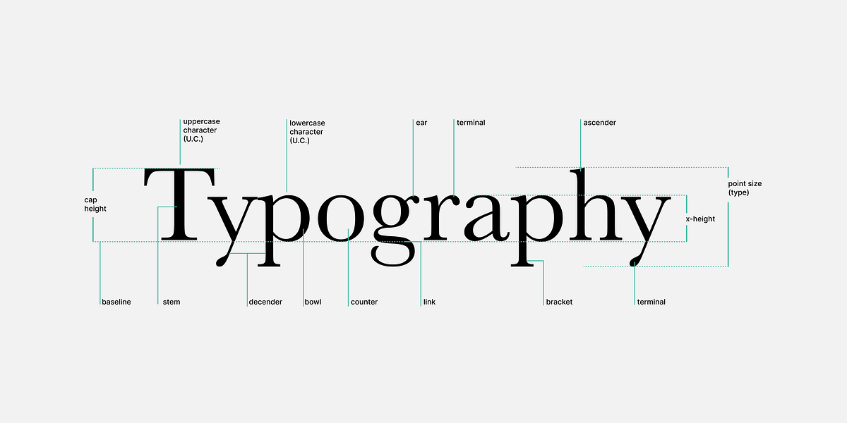
Typography shapes written language into a visual experience where letterforms, spacing, and layout determine readability, tone, and user engagement. Letter anatomy—ascender, descender, baseline, and x-height—defines proportions and perceived size, influencing type selection and pairing. Serif faces tend to guide the eye along lines of text while sans-serifs read cleaner and more modern. Kerning, tracking, and leading establish rhythm by adjusting spacing between letters, across text blocks, and between lines. Alignment choices (left, right, center, justified) alter reading flow and aesthetics. Consistent microtypography and conscious type pairing improve legibility and signal professionalism.
"Typography isn't just about picking a pretty font. It's the craft of shaping written language into a visual experience - how words look, breathe, and interact on a page or screen. Good typography quietly guides the reader, while poor typography shouts for attention in all the wrong ways. Every detail - from letter spacing to line height - affects how users read, feel, and engage."
"Kerning, tracking, leading These three terms define the rhythm and flow of text. Kerning adjusts the space between individual letters, tracking controls spacing across whole words or paragraphs, and leading (pronounced "ledding") sets the space between lines. Think of them as the breathing room of type. Too tight, and words feel suffocating; too loose, and they drift apart like strangers at a party. Consistent, intentional spacing is one of the clearest markers of professional typography - and one of the easiest to overlook."
Read at Medium
Unable to calculate read time
Collection
[
|
...
]