#letterform-anatomy
#letterform-anatomy
[ follow ]
#typography #css #accessibility #design #typeface-design #legibility #type-design #typeface #svg #web-design


Web design
fromSmashing Magazine
1 month agoBeyond border-radius: What The CSS corner-shape Property Unlocks For Everyday UI - Smashing Magazine
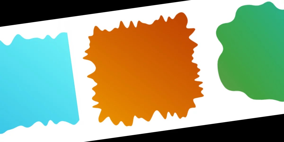
The corner-shape property enables beveled, scooped, and squircle corners, eliminating years of workarounds like clip-path and SVG masks that caused borders, shadows, and code brittleness.
#typeface-design
Typography
fromI Love Typography Ltd
1 month agoSteven Heller's Font of the Month: Curve Display - I Love Typography Ltd
Curve Display is a Didone-inspired display font that balances classical elegance with experimental, abstract letterforms, making it distinctive yet accessible for contemporary graphic design.
Typography
fromItsnicethat
1 month agoEleanor Yang merges the synthetic and organic to make typography you can touch
Synthetic Nature presents three typefaces—DNA, Mesh, and Data—that metaphorically represent life through biological, network, and computational structures, exploring how biology, computation, and culture merge.
fromAlexharri
2 months agoASCII characters are not pixels: a deep dive into ASCII rendering
One thing I spent a lot of effort on is getting edges looking sharp. Take a look at this rotating cube example: Try opening the "split" view. Notice how well the characters follow the contour of the square. This renderer works well for animated scenes, like the ones above, but we can also use it to render static images: The image of Saturn was generated with ChatGPT.
Software development
fromCSS-Tricks
1 month agoWhat's !important #6: :heading, border-shape, Truncating Text From the Middle, and More | CSS-Tricks
@keyframes animations can be named using strings, allowing syntax like @keyframes "@animation" { /* ... */ } with corresponding animation: "@animation" declarations. This capability has existed for 11 years across browsers, yet remains relatively unknown to many developers seeking alternative keyframe naming conventions beyond standard identifier formats.
Web development
fromMedium
2 months agoClarity or Conformity? Rethinking the Rules of Content Design
In Andor, I got chills when Mon Mothma warns the senate of a chilling truth: When we let noise, conformity, or fear dominate, we lose sight of what matters. We risk allowing the loudest voices, often the safest, the most predictable, to drown out individuality, identity, and truth. To me, this line... This line echoes a growing tension I feel in content design.
UX design
Graphic design
fromdesignyoutrust.com
2 months agoLi Zhongzheng Turns Modern Calligraphy Into Chunky Neon Lettering Pulsing With Sci-Fi Volume
A curated collection presents diverse contemporary visual art and design works, ranging from illustrations, photography, sculptures, and creative redesigns to unconventional materials and playful reinterpretations.
fromblog.logrocket.com
2 months agoLinear design vs. minimalism, brutalism, and neumorphism - LogRocket Blog
Linear-style UIs look simple, but the theming system has to do real work. Here's how to meet WCAG 2.2 contrast requirements across light, dark, and high-contrast modes whether you're using a UI library or rolling your own tokens.
UX design
fromblog.logrocket.com
2 months agoWhich UI libraries/frameworks support the Linear aesthetic? - LogRocket Blog
Teams often use customer and user interchangeably until it breaks alignment. Here's how separating the two clarifies research, prioritization, and messaging across B2C, B2B, and B2B2C products.
UX design

fromI Love Typography Ltd
2 months agoSteven Heller's Font of the Month: Cattivo - I Love Typography Ltd
Infused with history, the slab cannot help but suggest the old West's frontier clichés, for such ephemera as classic wanted posters, political broadsides, cautionary warning signs, and more generic commercial applications. Cattivo is a brand-new 18-font family that, when used in any weight and size, cuts through nostalgic predictability and provides a welcome alternative to such popular Egyptian-style slab serifs as Stymie and Memphis.
Typography
fromI Love Typography Ltd
5 months agoILT Blog Redesign - I Love Typography Ltd
The main problem with the existing homepage was that, besides the most recent posts, other content, once it aged and 'fell off' the front page, was then difficult to discover. The new design makes more use of available screen 'real estate', is visually much richer, and reorganizes 18 years of posts, so that even older long-forgotten posts are more easily found.
fromI Love Typography Ltd
6 months agoSteven Heller's Font of the Month: OTC Textura - I Love Typography Ltd
Blackletter typefaces elicit many contradictory emotions depending, of course, on the context in which they are used and the manner in which they are composed. Sometimes they bark commands - STOP or BEWARE. Other times they are comforting in an ecclesiastical way - Christmas and Easter greetings. During World War II Blackletter was menacing for those in occupied lands who read it as exclusionary - as in FORBIDDEN or DANGER; others accepted it as patriotic
Typography
from99% Invisible
2 months agoThe Em Dash - 99% Invisible
Vance, a Portland-based journalist who runs Stumptown Savings, a newsletter covering local grocery deals, had been accused of using ChatGPT to write his content. The evidence? His use of em dashes. "A Reddit user accused me of using AI, pointing to my use of, quote, extra long M dashes that are not possible to replicate on a normal keyboard," Vance recalls. The accusation stung, particularly because Vance spends 40 hours a week personally visiting grocery stores and crafting his newsletter by hand.
Typography
[ Load more ]