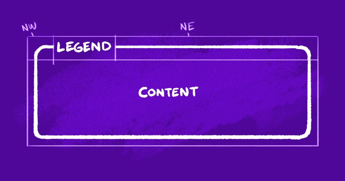
"A few details I'm proud of: It's actually transparent (backgrounds show through) The border remains middle-aligned with the "legend," even when it breaks to multiple lines You can easily tweak its appearance via CSS custom properties So, how's it work? Our markup consists of three elements: An outer container (our fake <fieldset>) A heading (our fake <legend>) A wrapper for the inner content"
"Instead of struggling to overlay the "legend" while clipping the border beneath, we're going to slice the containing shape into three chunks: One for either side of our legend, and one for everything below. We already have elements for our legend and lower content section. To avoid cluttering the markup, we'll use pseudo elements to represent the "northwest" and "northeast" slices. First, let's translate our sketch to a CSS Grid. I like to use grid-template-areas to make a little text-based representation of the layout: To keep our legend middle-aligned to the top of the adjacent borders, we'll have it span an additional row (one earlier than the corner areas): We should also add some column and row definitions so"
The technique recreates a <legend>-style heading that overlays and partially clips a container border while remaining transparent and middle-aligned. Markup uses three elements: an outer container (fake <fieldset>), a heading (fake <legend>), and an inner content wrapper. The containing shape is visually sliced into three chunks: left and right top slices and a lower section. The top slices are implemented with pseudo-elements to avoid extra markup. A CSS Grid with grid-template-areas positions the heading to span an extra row so the heading centers over adjacent borders. CSS custom properties enable easy appearance tweaks.
Read at Cloud Four
Unable to calculate read time
Collection
[
|
...
]