Web development
fromWebKit
1 month agoWebKit Features for Safari 26.4
Safari 26.4 introduces 44 features, including CSS Grid Lanes and WebTransport, focusing on developer requests and improving existing functionalities.
Support is limited to Chrome only because this technique uses recently released features, including corner-shape, sibling-index(), and unit division. In this article, we will explore another type of grid: a pyramidal one. We are still working with hexagon shapes, but a different organization of the elements. A demo worth a thousand words: For better visualization, open the full-page view of the demo to see the pyramidal structure. On screen resize, you get a responsive behavior where the bottom part starts to behave similarly to the grid we created in the previous article!
Anytime an exciting new web technology starts to land in browsers, developers want to know "when in the world am I going to be able to use this?" Currently, the finalized syntax for Grid Lanes is available in Safari Technology Preview. Edge, Chrome and Firefox have all made significant progress on their implementations, so it's going to arrive sooner than you think. Plus, you can start using it as soon as you want to with progressive enhancement.
In that same GitHub thread, you'll read that Tab Atkins-Bittner shared a "hacky" way to go about it with CSS Grid. You can have Grid do Masonry if you know the heights of the items ahead of time. It's a bit hacky, but you set the grid container to grid: auto-flow dense 1px / <column widths here>;, then set each item to grid-row: span <pixel height as integer>; (for example, if the item is 50px tall, use grid-row: span 50;).
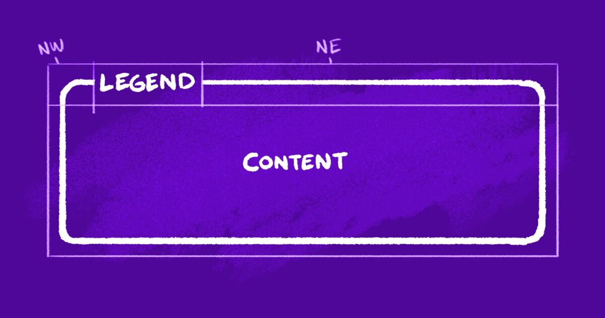
Using grid lines is a flexible and powerful way to place your elements on a grid, but, when looking at the code, it might be a bit hard to visualize. So Grid gives you another way to place your elements that might be easier to see called grid areas. There's a bit more upfront work involved, but the pay off might be worth it.