#color-psychology
#color-psychology
[ follow ]
#interior-design #home-decor #consumer-behavior #home-improvement #paint-colors #home-renovation #trends
#interior-design

Design
fromApartment Therapy
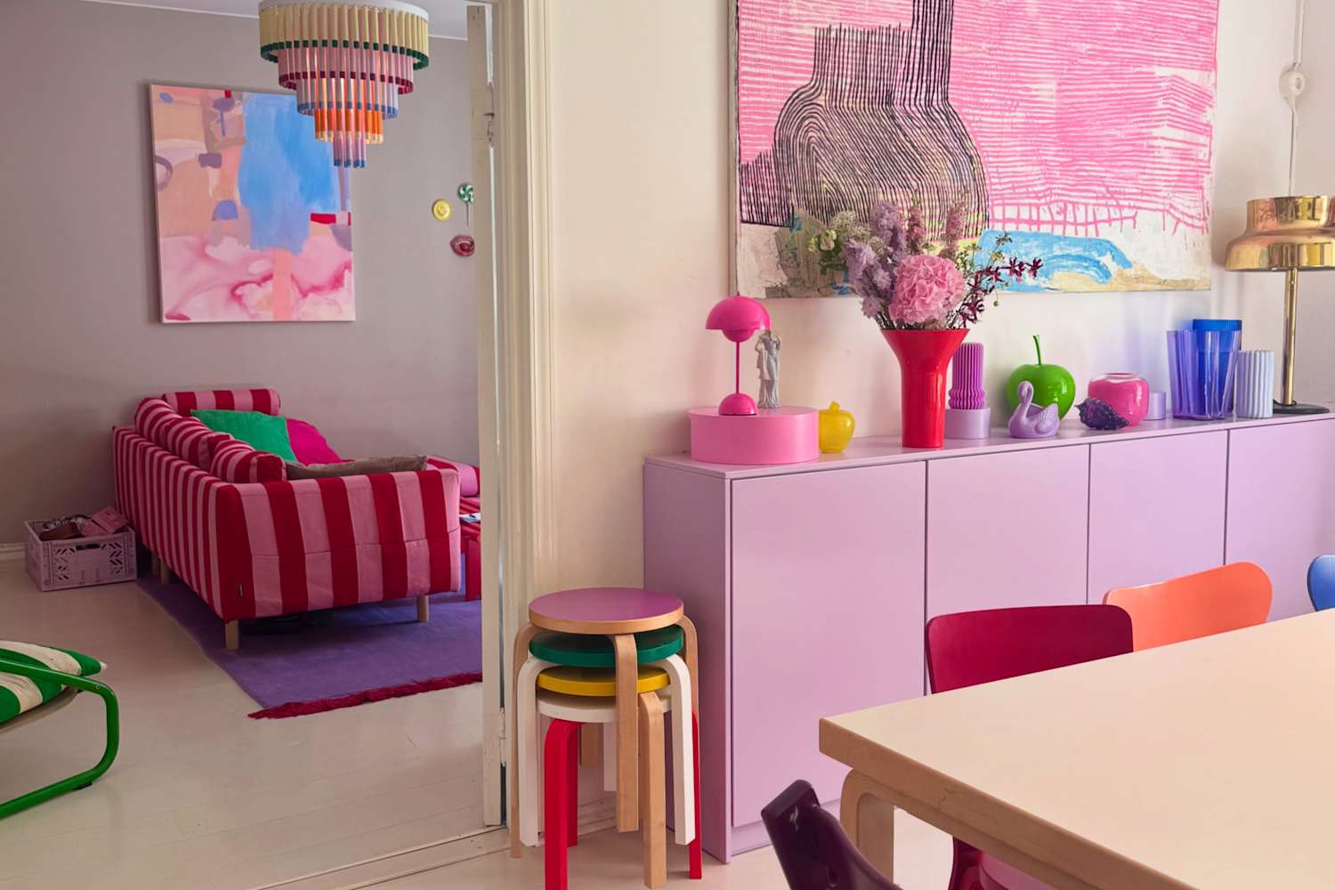
4 months agoThis Family Loves Their Color-Drenched 1920s Finnish Apartment So Much ... They Bought It Twice
A vibrant, renovated two-bedroom Turku apartment uses bold, paired colors and layered design to boost mood and provide emotional strength for a family facing serious health challenges.
fromApartment Therapy
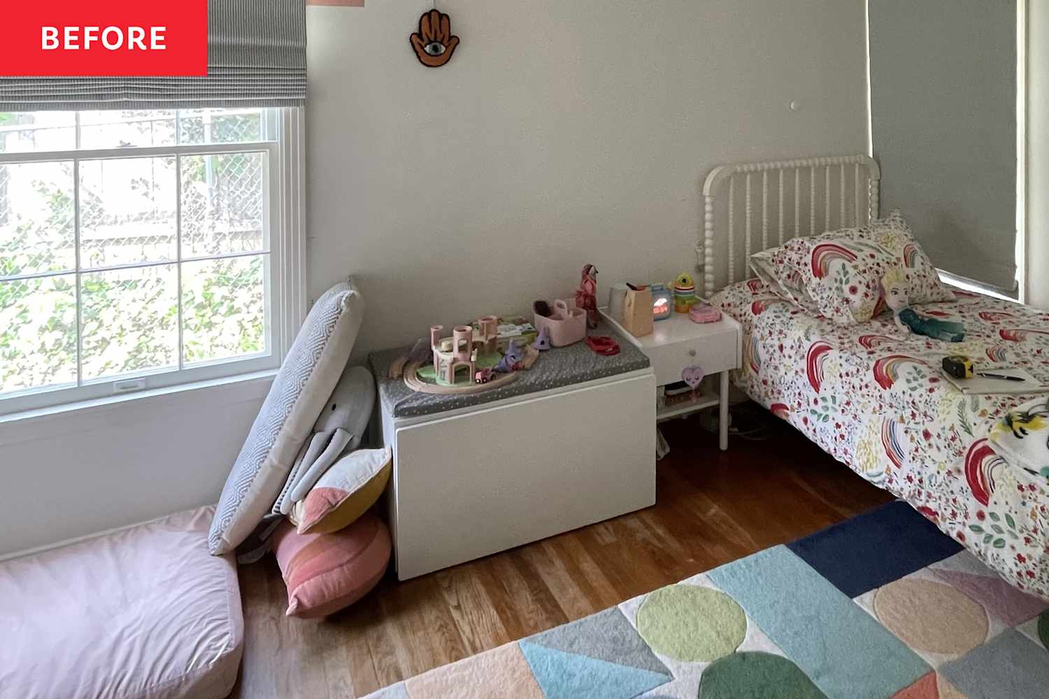
3 weeks agoBlue Paint and an IKEA Hack Revived a "Neglected" Bedroom
We still had nails in the walls from the previous owners! We had focused so much on other areas of the house that we completely neglected our bedroom. It felt boring, uninspiring, and very disorganized.
Renovation
UX design
fromYanko Design - Modern Industrial Design News
1 month agoBuddy's Wind-Up Mood Lamp Is the Anti-App We All Need - Yanko Design
A portable mood lamp with a single mechanical winding key eliminates unnecessary technology complexity while providing eight science-informed light modes for different moods and activities.


fromApartment Therapy
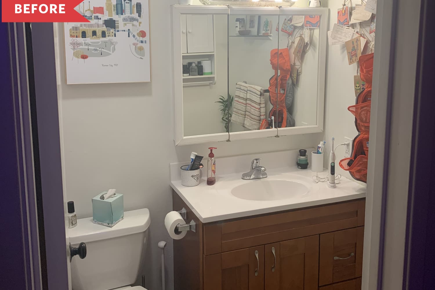
3 months agoThis One Color May Help You Focus Better at Home, According to Experts
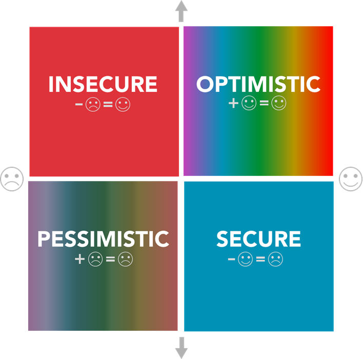
Choosing the right paint color can have a huge impact on your capacity for concentration, according to the experts. "Color can be a powerful, everyday way to support mental health because it speaks directly to the nervous system," says Hillary Schoninger, LCSW, an individual and family psychotherapist based in Chicago. "When we perceive color, our brain processes it as information and responds - sometimes with comfort and ease, and at other times with stimulation."
Mental health
fromPsychology Today
4 months agoThe Wardrobe Reset and Emotional Alignment
January invites reinvention. Gym memberships spike, planners sell out, and wardrobes quietly become sites of negotiation. Who am I now? Who am I becoming? And what no longer fits emotionally as much as physically? While New Year resets often focus on productivity or discipline, clothing is one of the most overlooked psychological tools for change. What we wear is not superficial.
Fashion & style
fromTravel + Leisure
5 months agoThis Is the No. 1 Crayola Color in the U.S.-and Here's Where to Find It in Your Travels
"Different explanations exist, with the most powerful one leaning toward ecological factors. Blue is liked because it is reminiscent of clear water and blue sky, all very positive natural phenomena," Domicele Jonauskaite, an experimental color psychologist at the University of Lausanne, Switzerland, said in a statement shared with Travel + Leisure. "Other experiences are more personal. For instance, in cultures where red carries celebratory significance or where lavender fields dominate the landscape, these associations might weigh more strongly in shaping preferences."
Design

fromYanko Design - Modern Industrial Design News
7 months agoButter Yellow Bose SoundLink Plus packaging turns a speaker into a kitchen staple - Yanko Design
Bose's latest portable speaker isn't just a tech gadget; it arrives in a package that looks like a stick of butter. The design, created by the creative agency Coffee 'n Clothes (CNC), wraps the SoundLink Plus in a soft cream‑colored foil with blue gradient accents that mimic the familiar butter wrapper you'd find in a kitchen pantry. The concept was unveiled alongside the speaker's new "Citrus Yellow" colorway, a shade that has become one of 2025's hottest trends in fashion and tech.
Gadgets
fromApartment Therapy
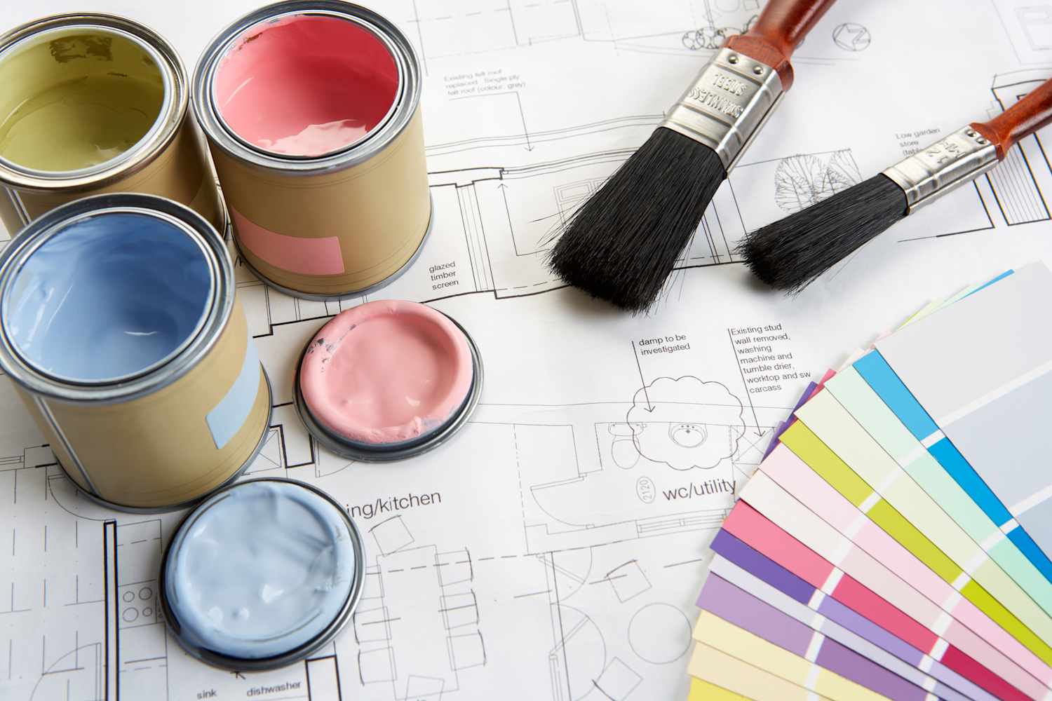
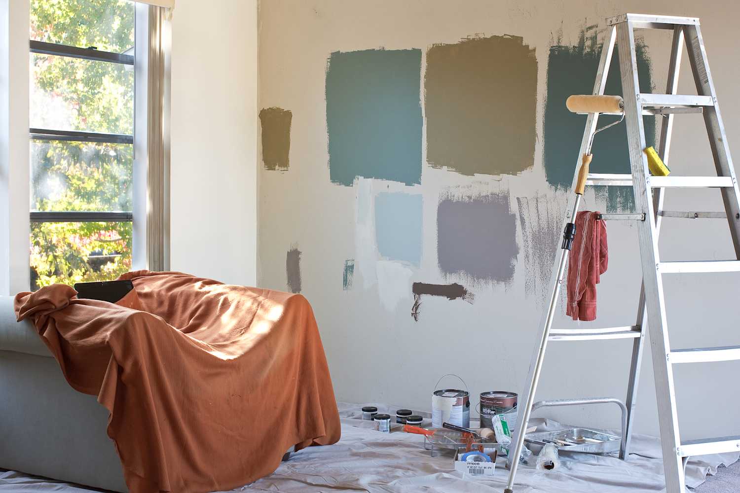
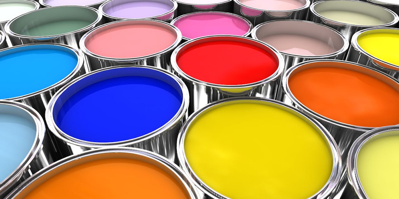
8 months agoI Asked 4 Designers What's the Worst Paint Color for Small Spaces, and They All Agreed on This One
Paint regret is definitely a thing, and you may feel that regret even more strongly in close quarters. One regret you might have? Picking a paint color that makes the room feel smaller, not bigger than it is. To help you avoid that post-paint heartbreak, I spoke with four designers to find out what colors to pick - and stay away from.
Remodel
Design
fromApartment Therapy
8 months agoI Asked 3 Designers What's The Worst Color to Paint a Bedroom, and They All Said the Same Thing
Red is a poor bedroom paint choice because it stimulates energy, can feel aggressive in large doses, and may disrupt restorative sleep by raising heart rate and blood pressure.
Renovation
fromApartment Therapy
10 months agoThis 500-Square-Foot Attic Apartment Was Dingy - Now It's a Cozy, Warm Home
Emily Goodling transformed a dingy attic apartment into a colorful, artistic home filled with books, without major renovations.
She believes in the aesthetic importance of books and vibrant colors in home decor.
fromApartment Therapy
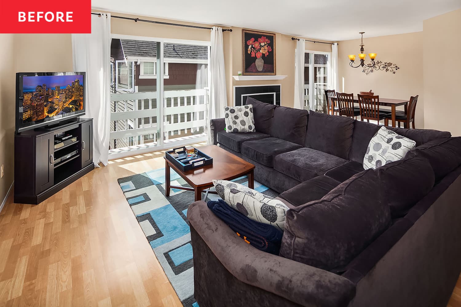
10 months agoThis Controversial Living Room Paint Color Might Make Your Home Worth More, According to a Study
Nearly one-third of sellers paint their places before listing them. So, what color should you pick for your rooms for the most return on investment (ROI)?
Boston real estate
[ Load more ]