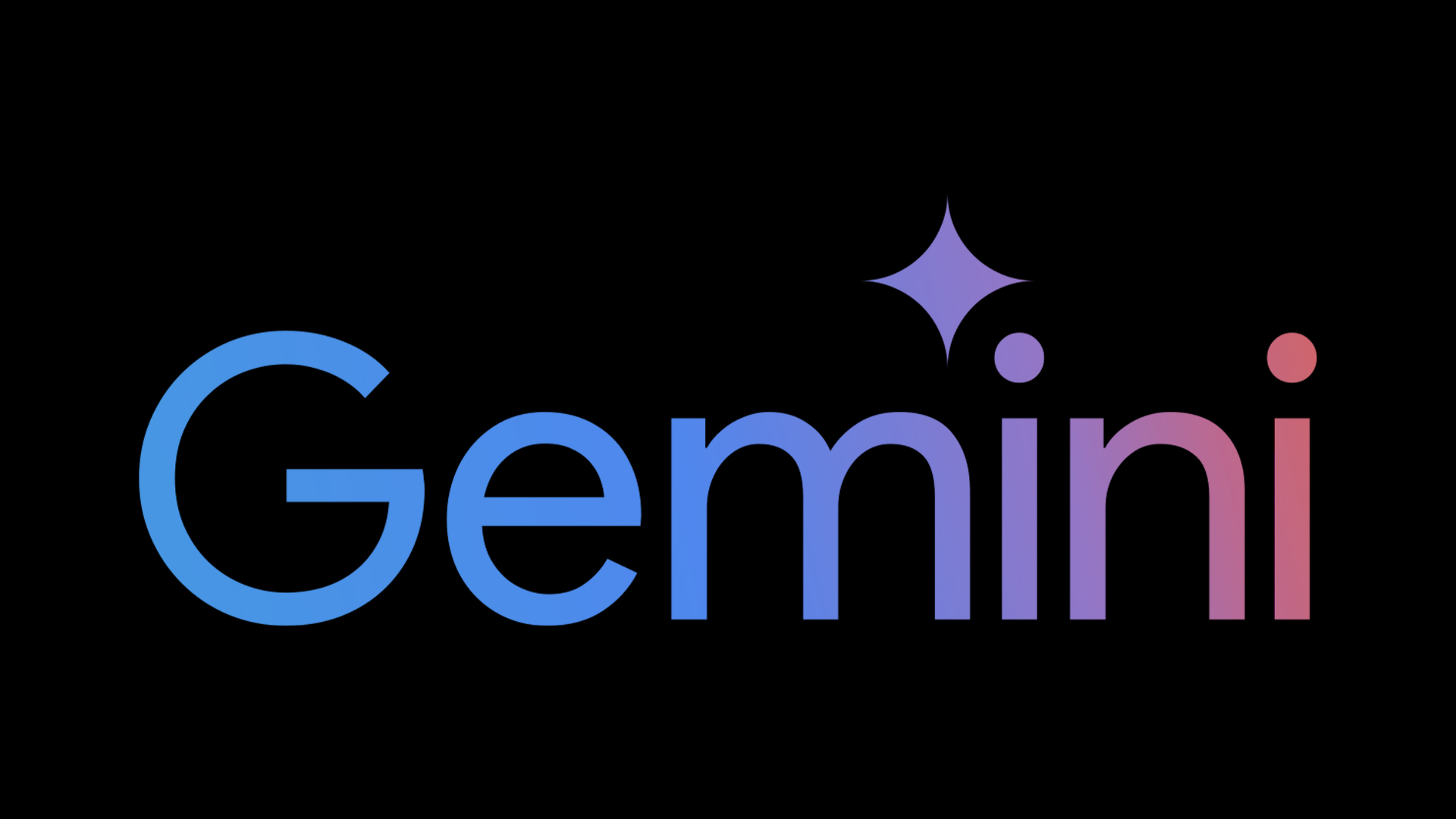
"Since its launch back in 2023, Gemini has always felt a little estranged from the Google brand due to its contemporary design, but thanks to a little revamp, it finally feels like part of the family."
"While the tweaks are small, they make a mighty difference, proving the power of colour in Google's iconic brand identity."
"Gemini's updated logo is a prime example of Google's strong brand identity. Instantly recognisable thanks to its vibrant colour makeover, the new design remains graphic and scalable."
"The new look features a gradient of Google's signature red, yellow, green and blue, alongside curved points that give the design a softer, more organic appeal."
The Gemini logo underwent a redesign to better align with Google's brand identity. Previously featuring a blue and purple scheme, the logo now incorporates a gradient of Google's signature colors—red, yellow, green, and blue. This change not only makes the logo feel more integrated with other Google products but also adds a softer, more organic touch to its design. The updated logo remains simple and instantly recognizable, reinforcing Gemini's place as an important member of the Google Workspace while maintaining its original graphic appeal.
Read at Creative Bloq
Unable to calculate read time
Collection
[
|
...
]