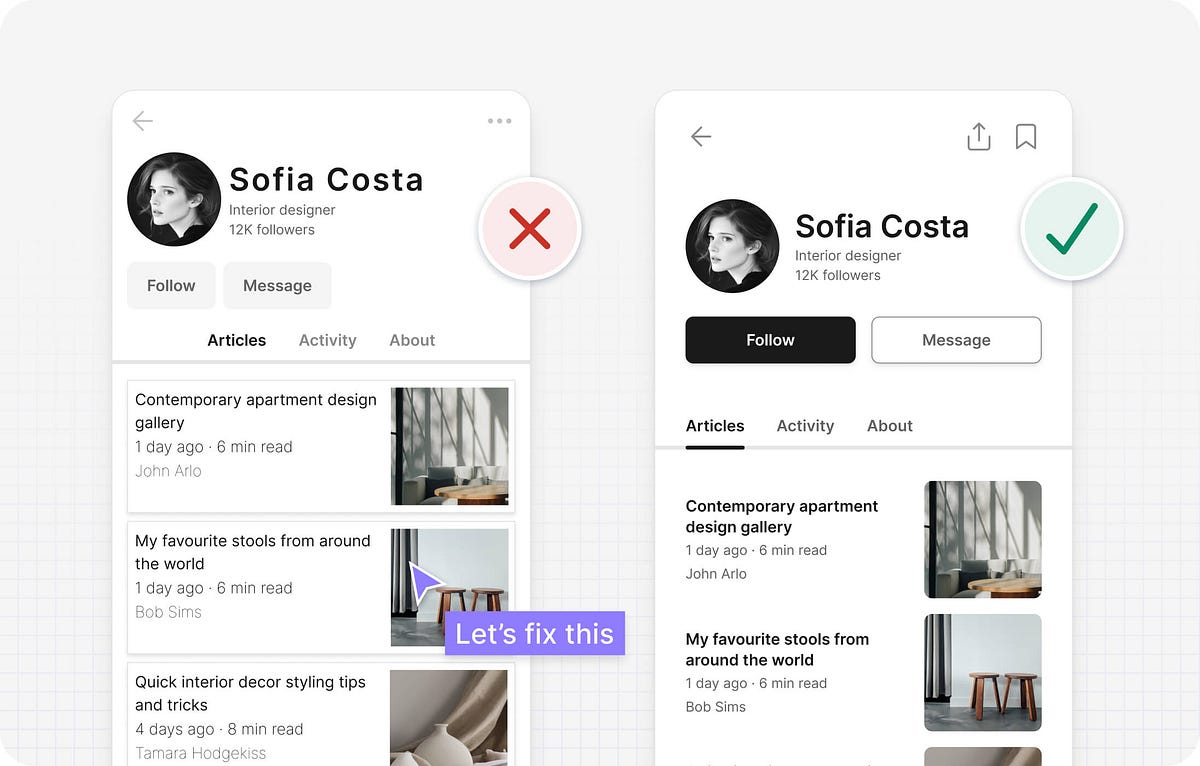
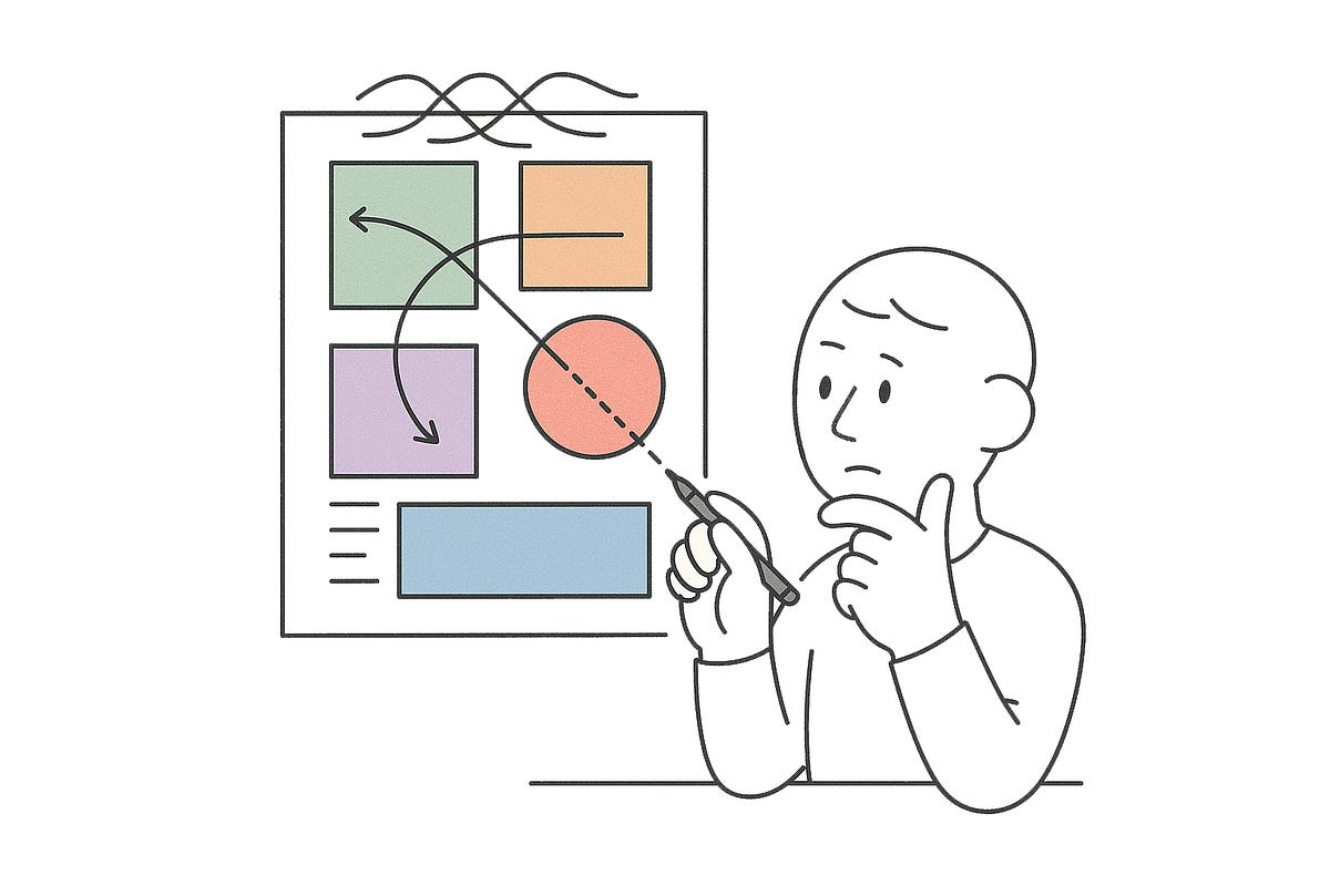
When 252 participants rated each version, the results were clear: screens that looked more attractive were consistently judged as easier to use. The correlation between beauty and perceived usability was strong ( r = 0.589), while functional factors showed almost no link. The researchers called this gap apparent usability versus inherent usability. Their conclusion: users don't judge ease of use by logic alone - appearance biases perception. This became known as the aesthetic-usability effect: if it looks better, it feels better.
Fifteen years. That's how long iPad users have endured the awkward, blown-up iPhone version of Instagram, pinching and zooming through pixelated posts while watching the device that practically invented modern tablets get ignored by one of the world's biggest social platforms. What makes a company overlook the device that defined mobile computing's future? The answer reveals everything about how tech companies really prioritize design decisions.
The human face is efficient to a degree that most digital products can only dream of. A shift in micro-expression lasts less than half a second yet conveys authentic emotional states. Designers of apps and platforms spend millions trying to approximate that kind of fidelity with loading animations, progress bars, or notification pings. But the face does it effortlessly, in real time.