"Over the years, the landscape has evolved but our DNA remains the same - bold, authentic, and unapologetically real. This new visual identity is not just about a fresh look, it's about reinforcing who we are and where we're headed."
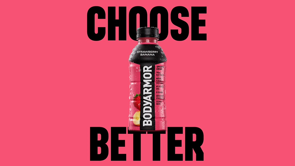
"The bodyarmour brand reinforcement as I've decided to call it includes a streamlined new logo. It might be hard to spot the subtle differences, but the serifs on the logotype have been refined for a more modern and dynamic feel."
Coca-Cola's recent update of Bodyarmour's visual identity exemplifies a 'brand reinforcement,' which enhances the brand's existing identity without altering its core strategy or values. The revised logo features subtle refinements intended to convey a modern, dynamic essence. Additionally, the packaging upgrades emphasize key product details like natural ingredients, responding to consumer desires for transparency. By showcasing its authenticity and focus on performance, Bodyarmour effectively positions itself amidst a crowded market of energy drinks that often fail to do so.
Read at Creative Bloq
Unable to calculate read time
Collection
[
|
...
]