UX design
fromMedium
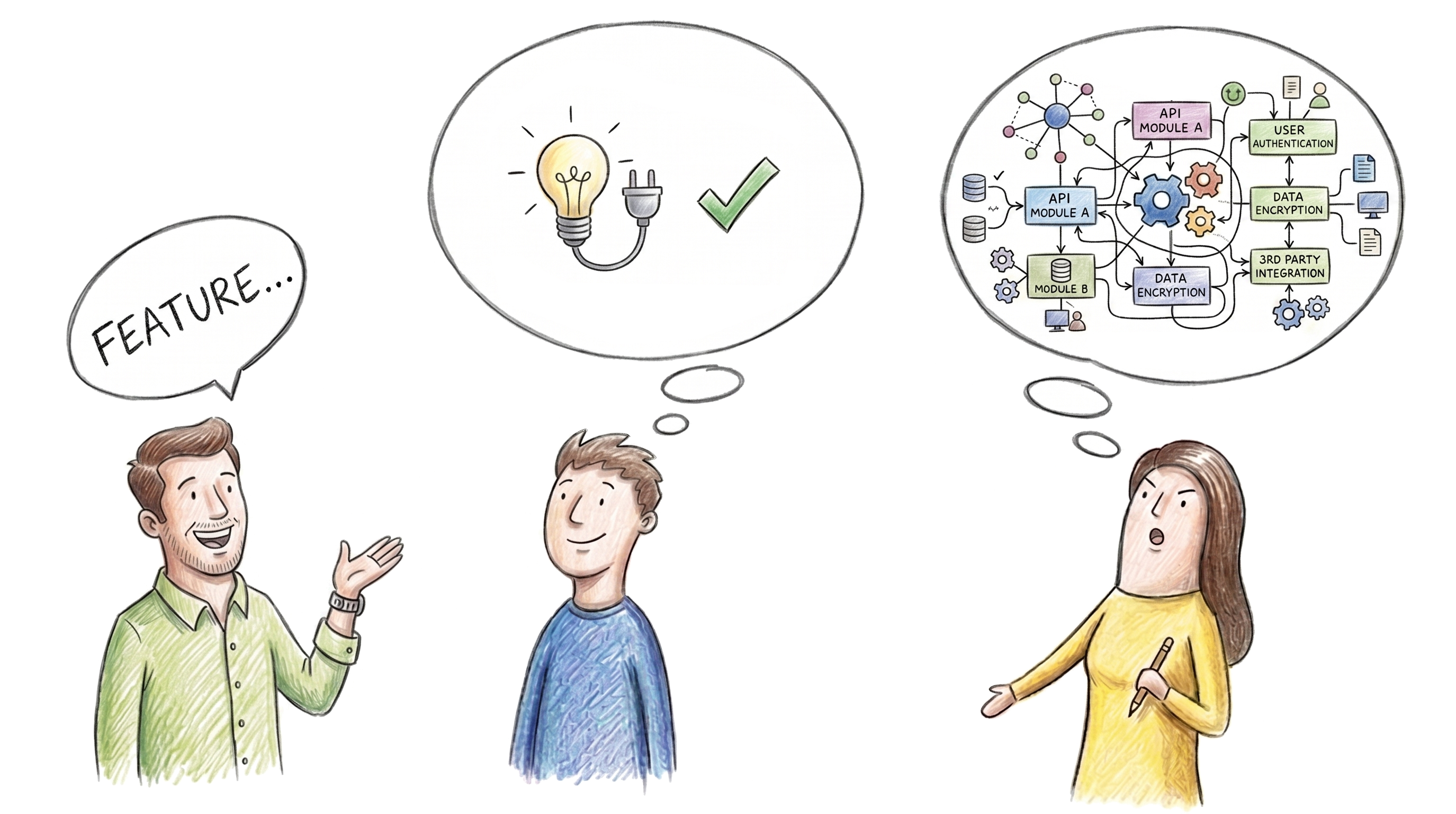
11 hours agoYippee IA: Six principles for creating a successful information architecture
Poor information architecture makes content hard to find, causing users to abandon searches and reducing sales and engagement.
Designer Keon-Jo took the actual geometry of an F1 rear wing, the profile, the curvature, the aerodynamic structure, and translated every element with full fidelity into a functional object. The result is 100% carbon fibre, unmodified and unapologetic, with every surface showing the raw woven weave exactly as it comes. Nothing softened, nothing added.
Much of design is conversation between what is and what isn't-in binary code, the specific weave patterns in fabric, and the weight found in negative space. RAD Furniture brings this sensibility of contrasts to life in the Post Collection, devised in collaboration with Los Angeles-based designer Sam Klemick. An adaptation and expansion of Klemick's wooden Bell Chair into furniture made out of metal, Post Collection features hefty metal legs that ground each piece firmly in space.
XPPen's Pilot Pro is the brand's first dedicated editing console, and it makes a confident debut. It packs 16 customizable buttons, three dials, and an all-way joystick into a compact controller built for one-handed, eyes-free operation. The premise is straightforward: let the left hand manage the shortcuts so the right stays on the mouse and your eyes stay on the screen.
Charm your guests with the GreenRow camelback love seat that takes inspiration from Victorian design. Its polished look comes from meadow floral upholstery over a sleek solid-wood frame that's anchored by a stretcher base and turned legs in a sophisticated espresso finish. The inside seating is surprisingly deep, but if you really want to stretch out, you might want to get the matching ottoman.
Although located next to Shenzhen Central Park, the campus is separated from it by surrounding high-rise residential towers, which form a barrier between the park and the school. The project therefore began with a fundamental question: how can nature be brought back into the everyday life of the campus?