Web design
fromSitePoint Forums | Web Development & Design Community
4 days agoHow Important Is ADA Website Compliance for SEO and User Experience in 2026?
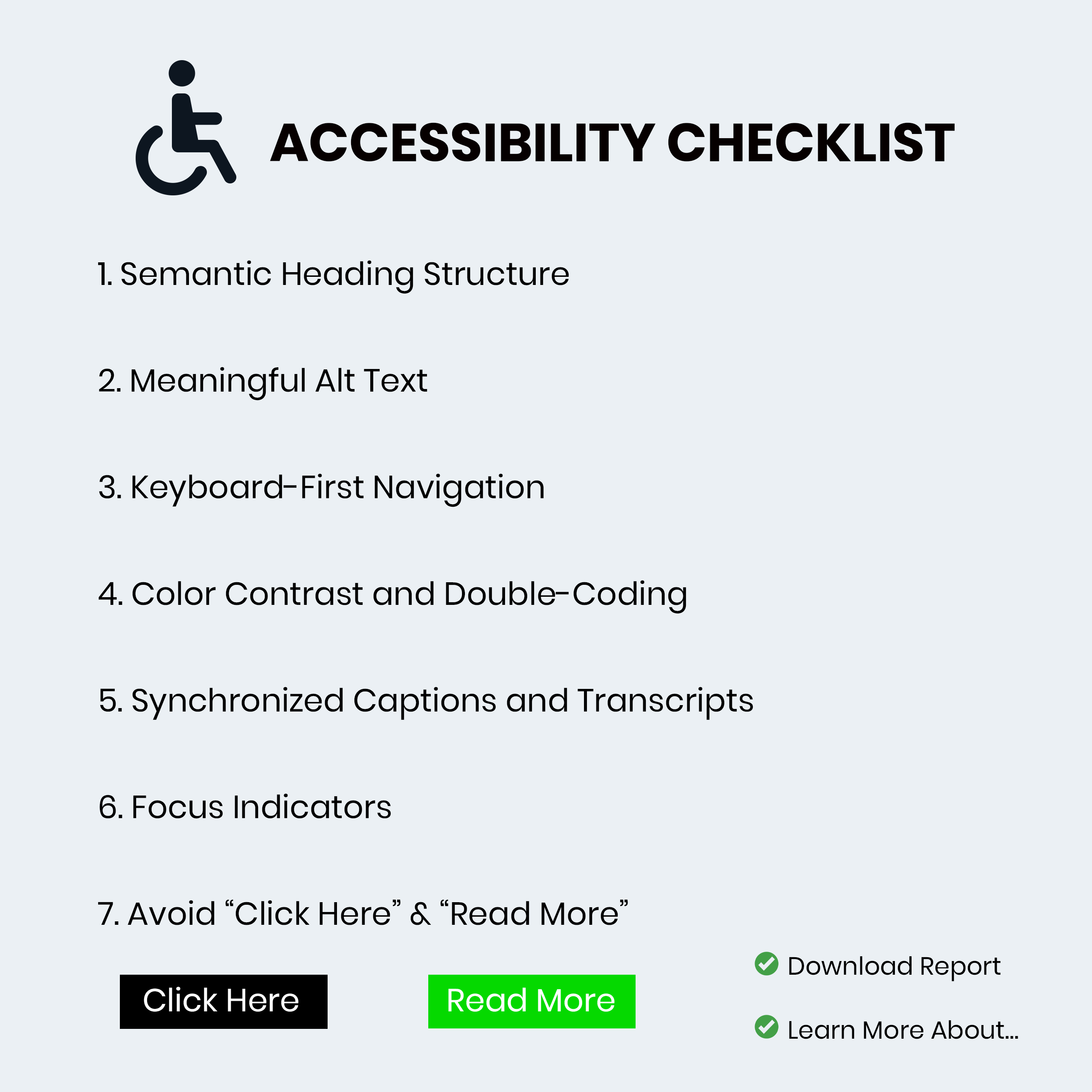
Accessibility improvements aligned with WCAG and inclusive design can enhance mobile usability, user experience, and SEO while reducing ADA-related website risk.