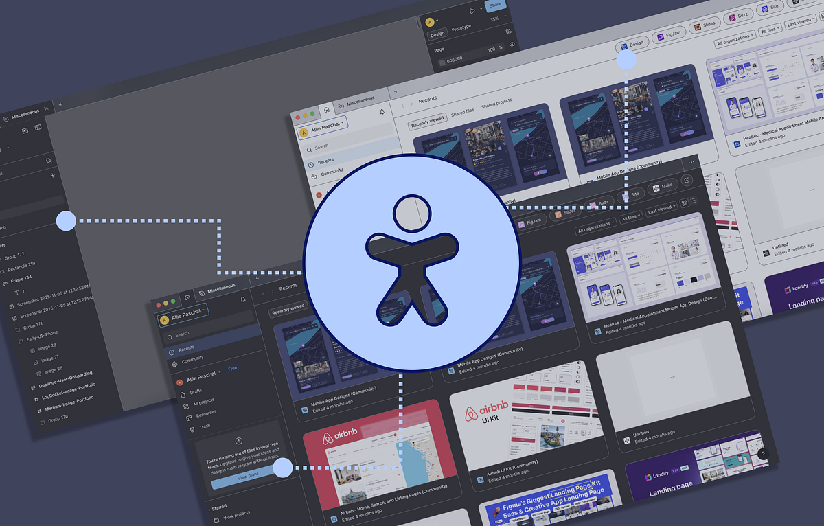
"Figma has introduced both an enhanced contrast mode (supporting both light and dark themes) as well as improved keyboard navigation. These aren't "nice-to-have" features, but show core advancements that align with WCAG accessibility standards and real user needs. Let's look at both features. Enhanced contrast mode This feature may seem obvious and simple, but you'd be surprised how many design tools don't allow users to customize their interface beyond swapping between light and dark themes."
"When enhanced contrast mode is toggled on, the difference is very noticeable on UI controls like buttons, as well as the dividers separating sections of the interface. This feature significantly impacts users with low-vision or even users working outside in the sun. Not only that, it helps clarify what is currently selected or interactive for all users. Here is a comparison on the color contrast ratios with the enhanced mode turned on/off:"
Figma added an enhanced contrast mode that supports both light and dark themes and increases contrast on UI controls and dividers. The enhanced mode improves visibility for low-vision users and people working in bright environments, and it clarifies selection and interactivity for all users. Measured contrast examples include the "Design" file button improving from 1.24:1 to 4.6:1, and the "View plans" button improving from 2.99:1 to 7.72:1, with the latter failing WCAG when the mode is off. Menu steps allow users to toggle enhanced contrast in Preferences → Accessibility settings. Figma also improved keyboard navigation to better support users who cannot use a mouse or trackpad.
Read at Medium
Unable to calculate read time
Collection
[
|
...
]