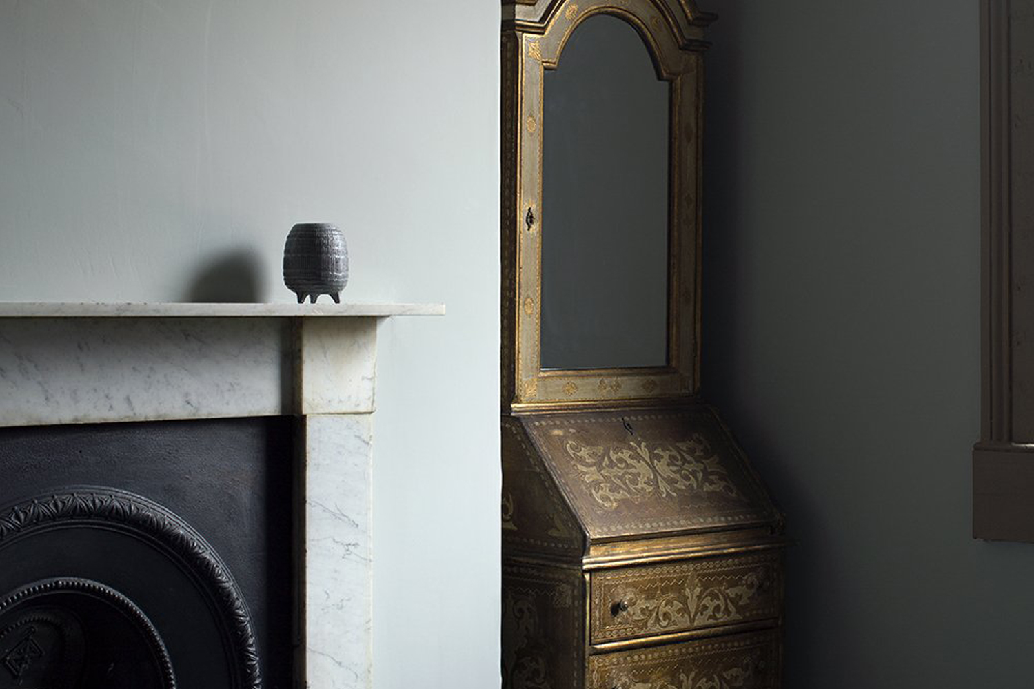
"For their design of the Schloss Teutschenthal hotel in Germany, architects Lea Korzeczek and Matthias Hiller of Studio Oink applied Farrow & Ball Elephant's Breath on the walls of room interiors. "At first glance, the color appears to be a warm gray with a soft clay undertone," Lea explains. "Depending on how the light hits the color, it can appear slightly pinkish or more blue-gray. These subtle nuances and this versatility fascinate us about this color...""
"Anki Linde of Paris-based firm LSL Architects expresses her passion for white shades, stating, "I'm a great lover of shades of white and I use the whole palette of nuances constantly in my work. The choice of color is, of course, determined by the placement of the room: north/south-facing, floor, style, and type of interior...""
"Architects Ronan Le Grand and Konrad Steffensen of Corpus Studio favor Pointing from Farrow & Ball, describing it as "a warm, creamy yellow-white with a touch of pink." This nuanced yellow-white was applied to a Parisian apartment renovation."
Nuanced paint colors are subtle shades close to white that provide a significant impact on interiors. Architects and designers favor specific shades that impart warmth, healthy glows, or serene atmospheres. For example, Farrow & Ball's Pointing is a warm, creamy yellow-white chosen by Corpus Studio for a Parisian renovation. LSL Architects use Sable Gris, a pinkish grey, that enhances complexion and softens interiors. Studio Oink highlights Elephant's Breath for its versatility, appearing gray or blue-gray depending on lighting conditions.
Read at Remodelista
Unable to calculate read time
Collection
[
|
...
]