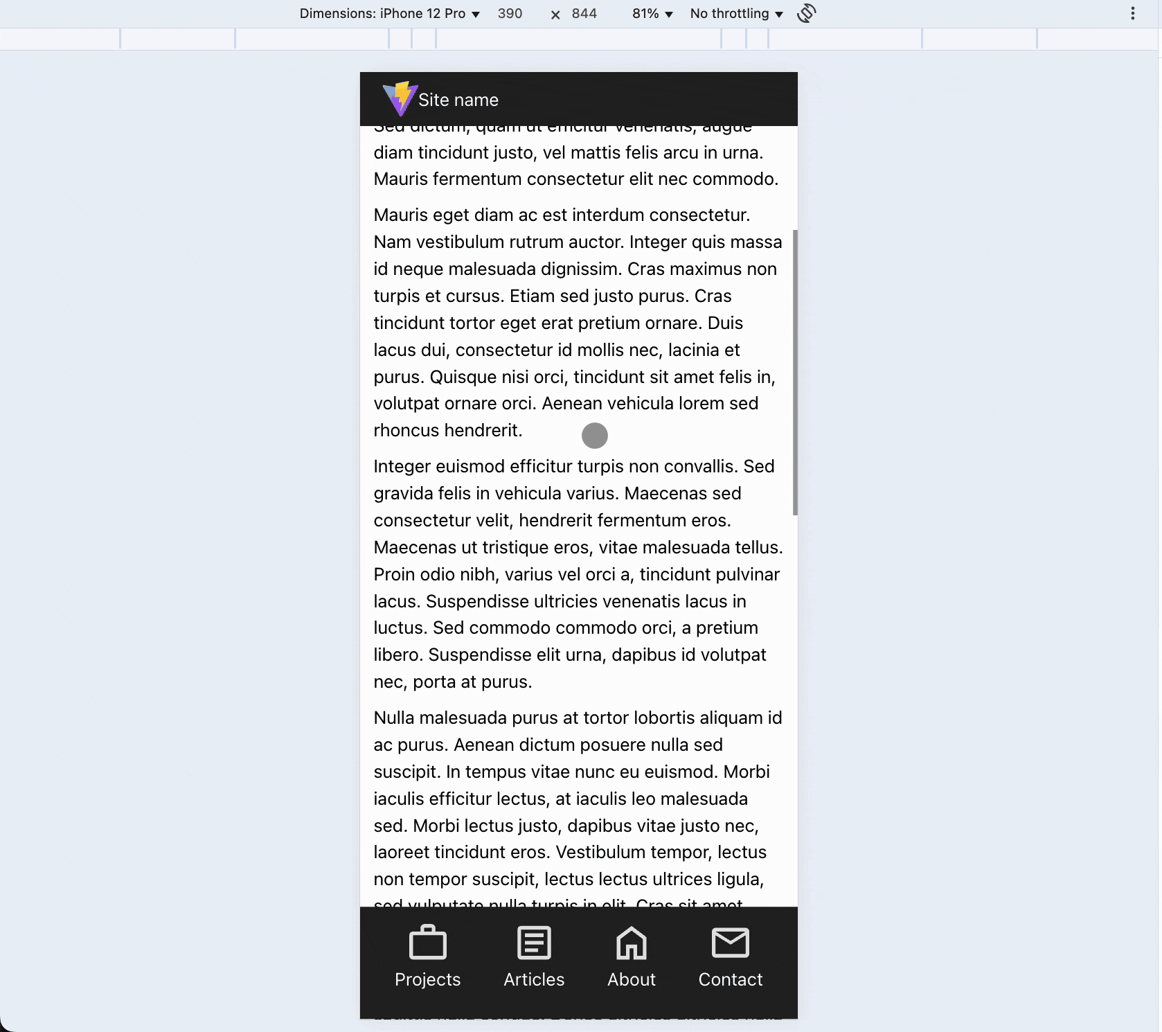
"On smaller screens, every bit of space counts. Hiding the navigation bar while scrolling down and showing it while scrolling up enhances usability."
"To build a responsive mobile experience, we recommend using Vite for local development, which simplifies mobile testing while using standard web technologies."
"The mobile layout's design focuses on placing navigation buttons at the bottom for easier access, contributing to a better user experience on mobile devices."
"The HTML structure consists of a header for the logo and navigation, and a main content area, ensuring clarity and usability on both mobile and desktop."
The article guides readers through creating a mobile-friendly web layout using HTML, CSS, and JavaScript, emphasizing the importance of space on smaller screens. It recommends using Vite for efficient local development and testing on mobile devices, though it's not mandatory. Essential steps include cleaning up the default project structure, setting the base styles, and organizing the HTML layout with a header for navigation and a main content area. The layout optimally positions navigation buttons at the bottom for mobile usage while maintaining top placement for desktop views.
Read at Hackernoon
Unable to calculate read time
Collection
[
|
...
]