"The identity is centered around the positioning 'Only at Glyndebourne', which represents the unique nature of going to Glyndebourne."
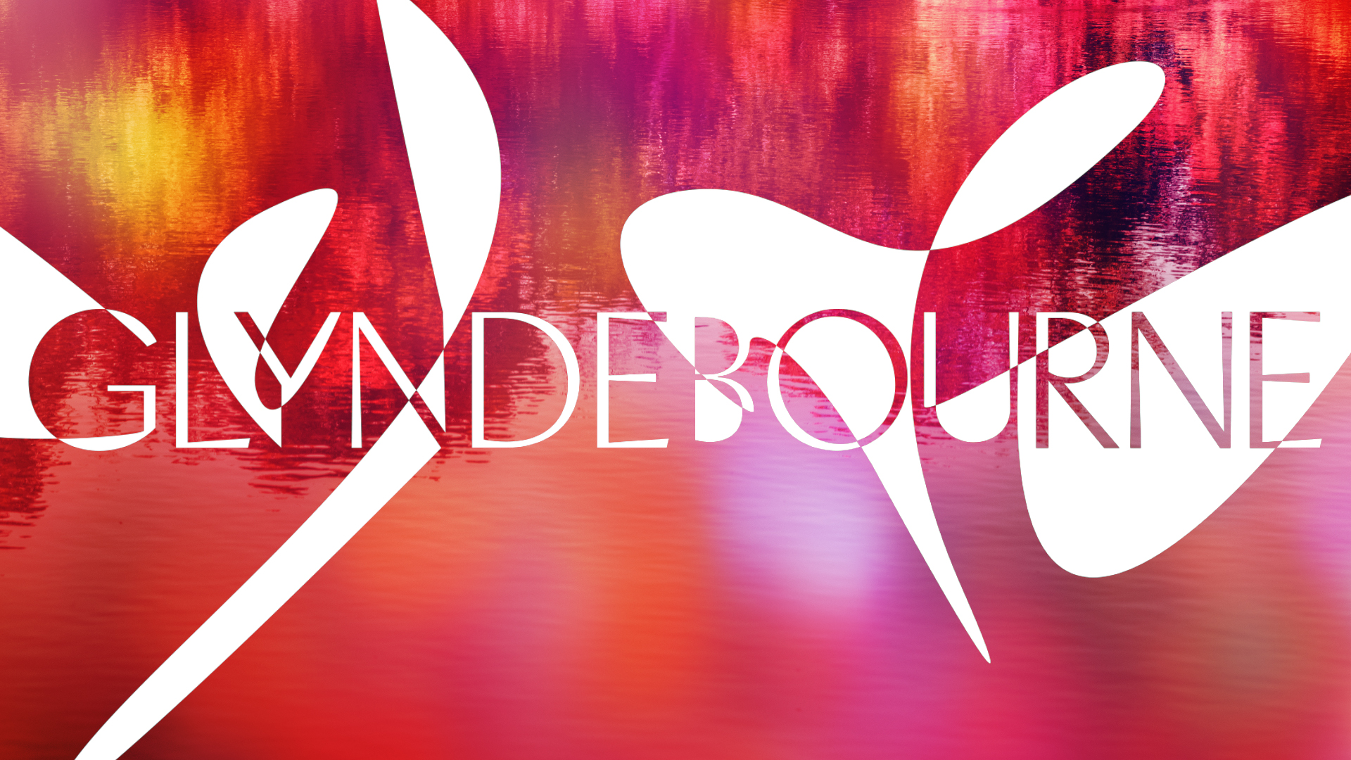
"The monogram is also clever - combining the 'G' and the 'B' on Glyndebourne in a smart and sophisticated way that looks particularly good on the likes of deckchairs."
Pentagram, led by Marina Willer, has redesigned the identity of Glyndebourne opera company as it nears its 100th anniversary. The new brand reflects both the unique ambiance of Glyndebourne and its cultural significance, ensuring it attracts new and existing audiences. The identity features the concept 'Only at Glyndebourne', incorporates a new monogram and logotype using Heavyweight Digital Type Foundry's Pacific font, and draws inspiration from the locale's natural beauty, architecture, and vibrant culture, with Klein Blue as the primary color.
Read at Creative Bloq
Unable to calculate read time
Collection
[
|
...
]