"The new branding for Coca-Cola's vitaminwater pivots from a clinical image to a fun, bold identity, enhancing visibility and engaging younger consumers."
"Coca-Cola's rebranding of vitaminwater focuses on creating a singular and impactful front-face that eliminates visual clutter for greater brand recognition."
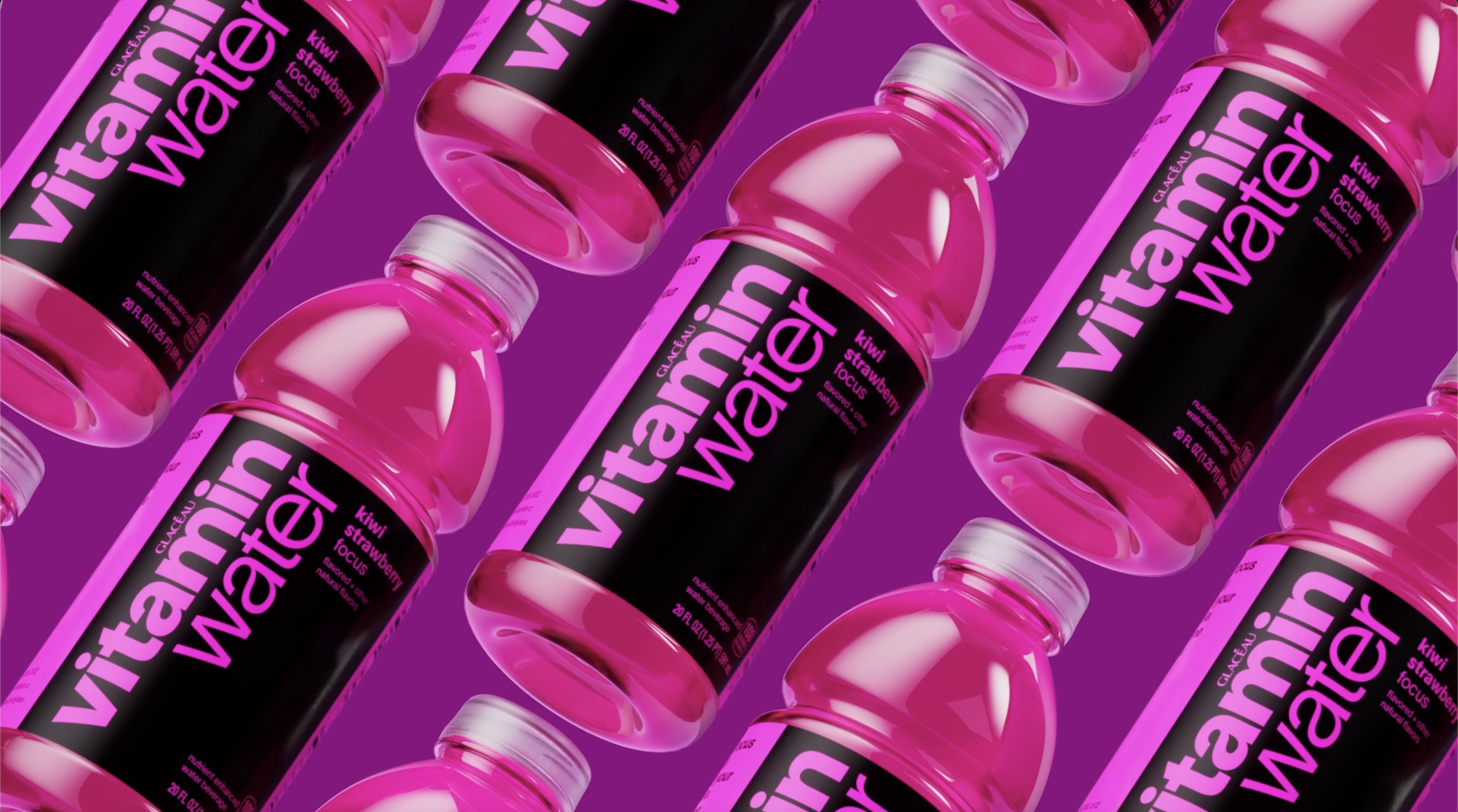
Coca-Cola's vitaminwater has undergone a significant rebranding effort, moving away from its pharmaceutical appearance to a vibrant and playful identity. This change is influenced by the current bold minimalism trend, focusing on maximizing shelf visibility and flavor recognition. The redesigned labels and updated logo, which features subtle elements referencing vitamin pills, aim to present a cleaner, more impactful look. Additionally, the brand's tone has shifted to a more relatable and engaging voice to appeal to younger consumers, ultimately enhancing its market presence.
Read at Creative Bloq
Unable to calculate read time
Collection
[
|
...
]