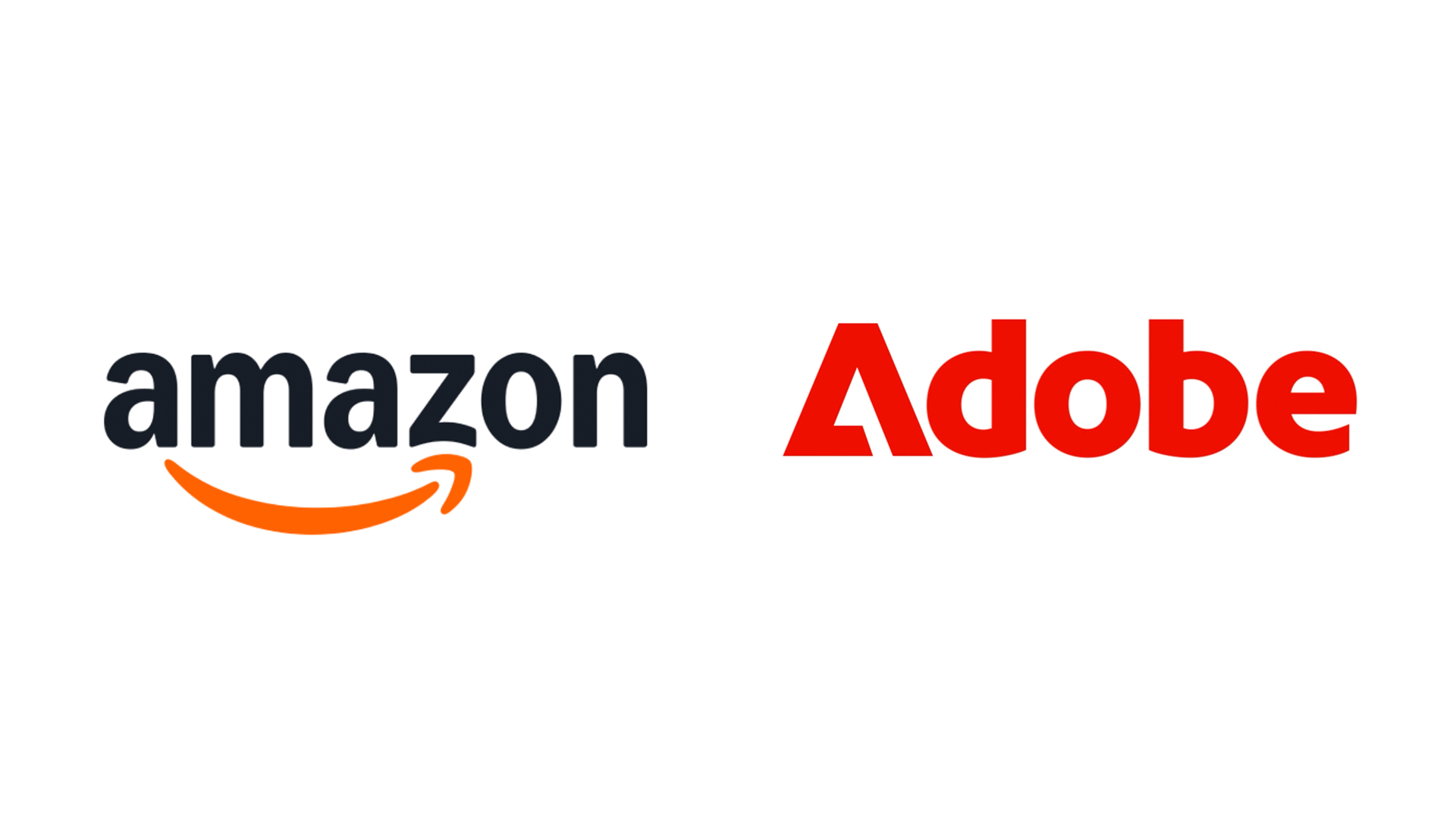
"When it comes to overall brand equity, subtle rebrands might be more powerful than splashy announcements, as seen with Adobe and Amazon's new identities."
"Adobe's new look has emerged steadily over the last two years, subtly iterating on existing assets without throwing them out, resulting in a cohesive brand experience."
"Amazonâs branding has been standardized to focus on its signature smile, featuring subtle tweaks that enhance its appeal, such as a deeper and more emphatic smile."
"According to Frontify's director of brand, subtle rebrands might go unnoticed by the public, but they can significantly impact brand authority and recognition."
In 2025, prominent brands like Adobe and Amazon have undergone rebrandings that prioritize subtlety, moving away from the dramatic changes seen in previous years. Adobe's rebrand, developed by Mother Design, involves a gradual evolution of its logo and color palette over two years, emphasizing cohesion without significant disruption. Amazonâs new identity, crafted by branding agency Koto, enhances its visual aesthetic with a refined smile logo and standardized design elements that reinforce brand authority. Although these changes may not be immediately visible, their long-term impact on brand equity could be substantial.
Read at Creative Bloq
Unable to calculate read time
Collection
[
|
...
]