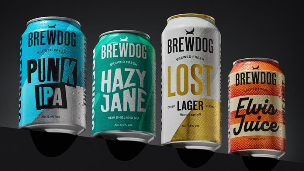
"This is the start of a new era for BrewDog. The new packaging will do something we have always sought to do right from the start - disrupt the category."
"It seems BrewDog has now realised that a standardised all-caps sans is more 'corporate larger' than freshly brewed real ale."
BrewDog is reinventing its brand identity after a more conservative rebranding in 2020. The Scottish craft beer company is launching new packaging designs for its core beers, focusing on distinctiveness while keeping its color palette. Key elements include individual font designs and graphic elements for each beer, moving away from standardization. The COO, Lauren Carrol, emphasized that this marks a new era for BrewDog, with a commitment to disrupt the category, encapsulated in their new tagline, 'Brewed fresh.'
Read at Creative Bloq
Unable to calculate read time
Collection
[
|
...
]