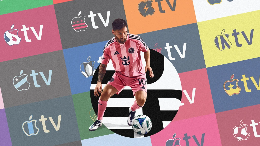
"For example, the Chicago Fire version includes the six-pointed star from the city's flag and the team's crest, while Atlanta United's is filled with the characteristic five red and black stripes that adorn the club's shirt."
"Although today's brand guidelines... still admonish 'Do not alter the logo'... there are now caveats... we encourage experimentation and favor expression over restraint."
"But unlike the flexible logo approach pioneered by MTV, these latest co-branded little apples are notable in that they represent a sort of logo alchemy."
"They represent the outcome of a sort of logo alchemy in which the design components of altogether separate organizations have been recombined into new forms."
With the start of its 30th season, Major League Soccer introduced custom Apple TV logos for each of its teams, reflecting their unique identities in the classic Apple design. This initiative is part of MLS's decade-long agreement with Apple for streaming. The trend marks a shift from rigid logo usage to a more flexible, creative approach to branding, illustrating how brands can visually signify partnerships by blending logos innovatively. This movement towards experimentation signals a changing landscape in branding, encouraging expression over strict adherence to guidelines.
Read at Fast Company
Unable to calculate read time
Collection
[
|
...
]