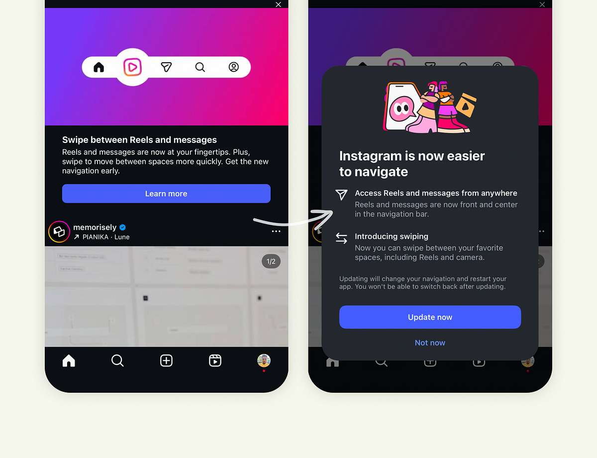
"They Informed Users First Before changing anything, Instagram showed an announcement right inside the feed. "Swipe between Reels and messages." The banner explained the upcoming navigation update with a short sentence, a clean visual, and a "Learn more" button. It didn't interrupt your session. It didn't feel forced. It invited curiosity. That alone is a big shift in mindset, from forcing change to introducing change."
"The overlay breaks down two things: What's changing: Reels and messages are now front and center. Why it's better: You can access them faster and swipe between spaces. It's clear, visual, and to the point. Then comes the real UX gem - the choice. Two buttons: "Update now" or "Not now." That moment of choice matters. It gives users a sense of control and reduces the psychological resistance that usually comes with UI changes. People don't hate new designs; they hate feeling blindsided by them."
"If you've been using Instagram for a while, you know this isn't how they used to do things. In the past, updates just appeared. You'd open the app one morning and the navigation bar was different, buttons were rearranged, and muscle memory went out the window. No heads-up. No explanation. No sense of control. And the internet would explode with backlash."
Updates previously appeared without warning, disrupting muscle memory and provoking backlash. The new approach announces redesigns in-feed with a short banner, a visual, and a 'Learn more' option that avoids interrupting sessions. The detailed overlay explains what changes (Reels and messages front and center) and why the change improves speed and swiping between spaces. Users are given two choices: 'Update now' or 'Not now', restoring a sense of control and lowering psychological resistance. After opting in, the navigation updates immediately and includes an onboarding overlay that explains how to use the new gestures and layout, reducing confusion and friction.
Read at Medium
Unable to calculate read time
Collection
[
|
...
]