"The first time I realized the font even existed was some time in 2017, when I was researching for my book about the history of typing."
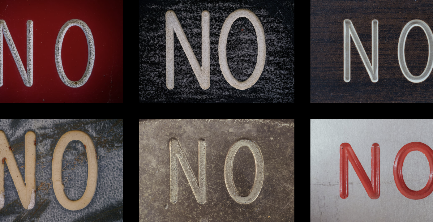
"The G always felt like it was about to roll away on its side. There was a goofy wavy hook sticking out of Q."
"Many keyboards, especially older ones, sported a particular distinctive font on their keycaps. It was unusually square in proportions."
"The strangeness extended to the digits. There was a top-flatted 3 resembling a Cyrillic letter, 7 sloping down uniquely."
Marcin Wichary reflects on his journey of discovering the Gorton font, a typeface he initially overlooked during his photography of fonts in New York. The author describes Gorton as peculiar with its unusual proportions and quirks. First noticed while researching typing history, the font's distinctive features presented a mix of mechanical and childish aesthetics. He illustrates its oddities found in the typography of old keyboards, emphasizing the discrepancies across keycaps, which tell a story of typographical evolution often unnoticed in modern design.
Read at Aresluna
Unable to calculate read time
Collection
[
|
...
]