"In essence, typography not only forms part of Apple's identity but also marks its evolution from quirky to elegant, solidifying its brand sophistication."
"The transition to the San Francisco typeface underscores Apple's commitment to a cohesive, innovative design language, blending functionality with aesthetic simplicity."
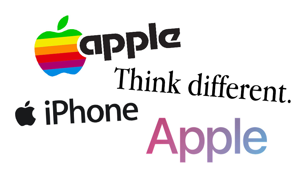
Apple's typography has undergone significant transformations, from the quirky Motter Tektura used before Macintosh's debut to the elegant Apple Garamond utilized for nearly two decades. The evolution showcases distinct design choices, playing a crucial role in Apple's brand identity. Today, Apple employs the San Francisco typeface across its products and marketing, highlighting a commitment to clean, modern aesthetics that aligns with its minimalist design ethos. This history illustrates the company's blend of functionality, creativity, and brand evolution in their typographic choices.
Read at Creative Bloq
Unable to calculate read time
Collection
[
|
...
]