""Brand is the thread that connects every part of an organisation together and shows what it stands for," says Tosh Hall, global chief creative officer at JKR. "For Blood Cancer United, that meant creating a brand united for all. That spirit now runs through everything, from the name to the design systems to the behaviours, building unity for the work it does and, most importantly, speaking to everyone touched by blood cancer.""
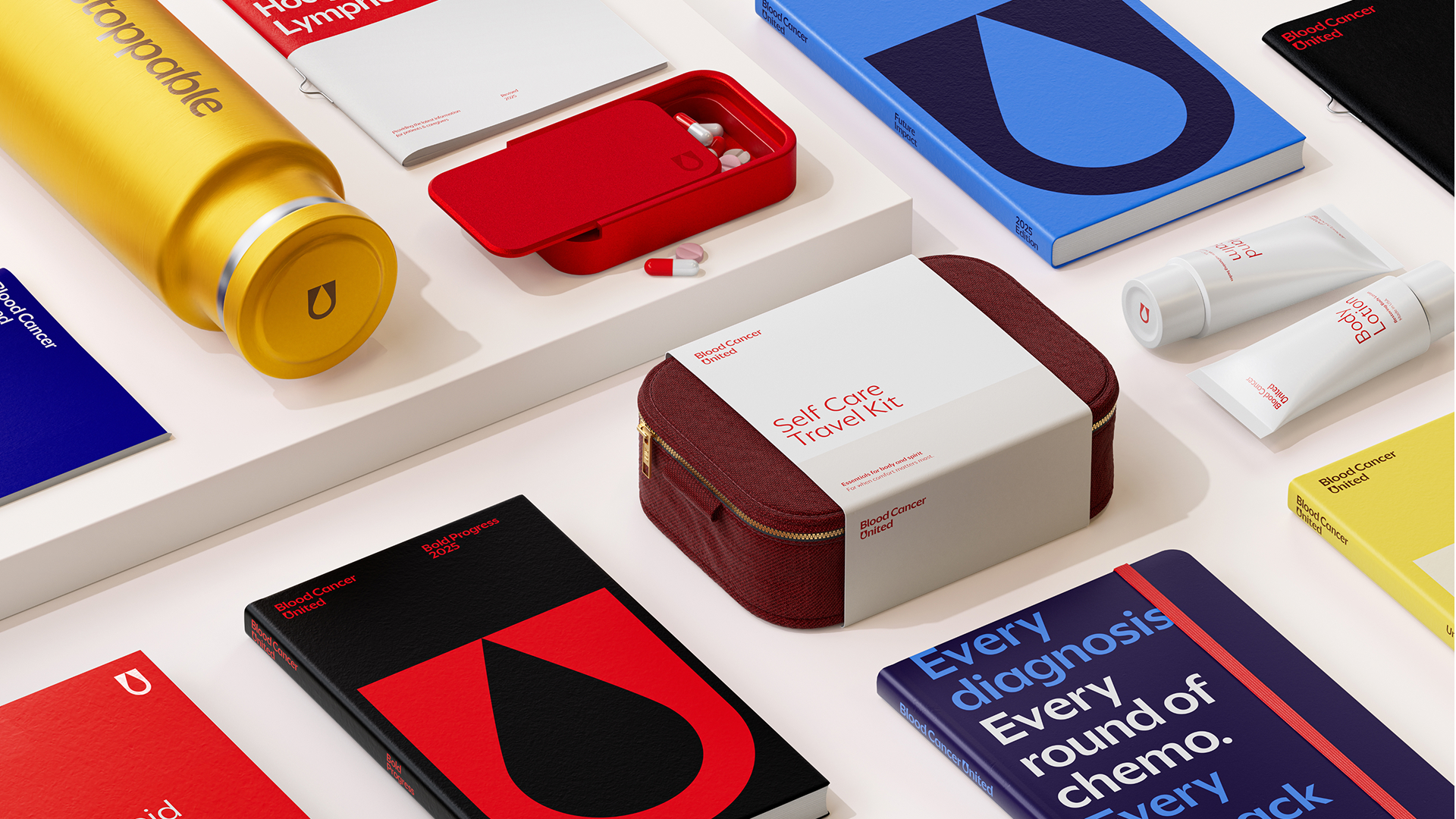
"At the centre of the visual identity is a simple yet striking blood droplet motif. Shaped from the 'U' in 'United', the design is scalable and universal, reflecting the organisation's commitment to all types of blood cancer. Paired with a refined voice "rooted in real stories that create meaningful connections," the "clear and compassionate" tone gives the identity a distinctly human appeal."
Blood Cancer United replaces the Leukemia & Lymphoma Society to better represent the full blood cancer community. The rebrand, led by global agency JKR, centers on inclusivity after the previous identity proved exclusionary to some blood cancer types. A central visual motif is a blood droplet formed from the 'U' in 'United', intended to be scalable, universal and reflective of commitment to all blood cancers. The voice is clear, compassionate and rooted in real stories to create meaningful human connections. A custom BC United Sans typography gives a simple, accessible aesthetic, and the unified identity will appear across digital channels, events and other touchpoints.
Read at Creative Bloq
Unable to calculate read time
Collection
[
|
...
]