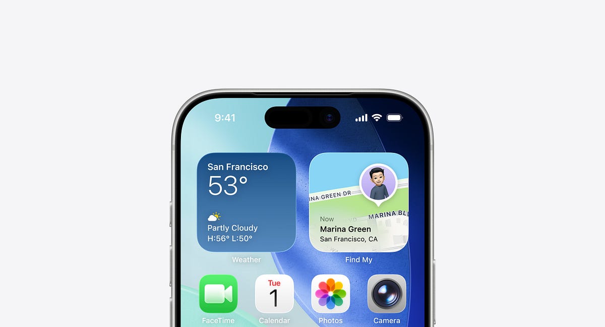
"And while most of the conversation has stayed around its shiny new aesthetic, I believe there's more to it than what meets the eye. I've been using iOS 26 for a while now, and as a product designer, I can't help but look beyond its visual novelty. Because every aesthetic shift in Apple's ecosystem isn't just a visual story, it's a usability statement."
"The invention (or rather, the introduction) of Liquid Glass has clearly pushed Apple's design team to explore it across the system. The new material isn't just a skin, it's a catalyst that has led to subtle but meaningful new interface patterns. Interestingly, many of these patterns could have existed even without Liquid Glass. But this material gave Apple the perfect reason to showcase something new."
"One of the most noticeable changes is in how the bottom navigation behaves across native apps. For years, we've gotten used to the standard edge-to-edge bottom navigation bar - predictable, anchored, and fixed. But in iOS 26, it now "floats." It's rounded, padded from all edges, and lifted ever so slightly from the bottom of the screen. This change doesn't alter the functionality of navigation. It still does what it's meant to do."
Liquid Glass functions as a system-wide catalyst that prompts new interface patterns beyond mere aesthetics. The material encourages experimentation and provides a reason to introduce subtle but meaningful UI changes that might otherwise have remained unrealized. When design choices prioritize showcasing a material, the resulting patterns reveal how teams negotiate form-versus-function trade-offs. The bottom navigation exemplifies this shift: it becomes a floating, rounded, padded element lifted from the screen edge. Navigation behavior and functionality remain the same while the new visual treatment changes perceived hierarchy and affordance.
Read at Medium
Unable to calculate read time
Collection
[
|
...
]