"FutureBrand has led a comprehensive rebrand of New York Life, marking 175 years of the insurance company's history with a renewed visual and conceptual direction. The updated identity is built around the idea of the 'Window of Opportunity,' a unifying concept that reframes the brand as a guide through moments of change rather than a static financial institution. With more than a century and a half of heritage, New York Life holds a longstanding position within the American insurance sector."
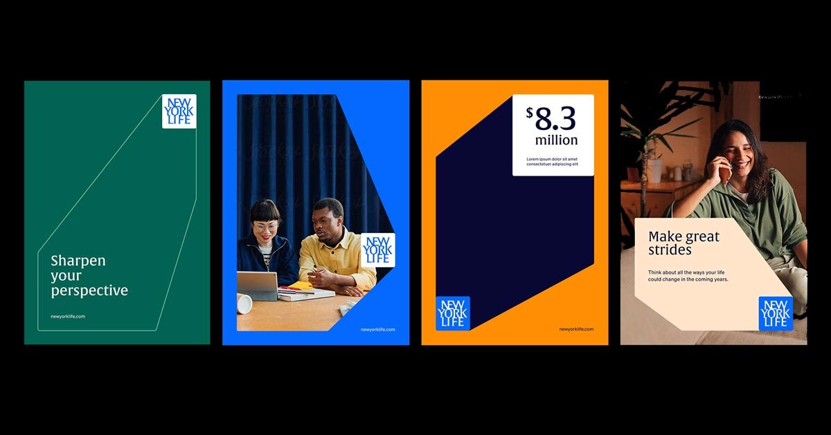
"Central to the new identity is the 'Window of Opportunity' concept by FutureBrand design group. This framework informs both messaging and design, positioning the company as a consistent presence during periods of transition and decision-making. Architecturally inspired visual cues, such as framing devices and layered perspectives, introduce a sense of depth and forward movement across brand applications. The visual system incorporates an updated color palette and contemporary typography to enhance clarity and flexibility."
"Photography plays a significant role, with imagery selected to reflect everyday life and transitional moments in a direct and relatable manner. Together, these elements create a cohesive design language that can extend across digital and physical touchpoints. the new identity introduces a renewed visual and conceptual direction a refreshed color palette enhances clarity layered compositions create depth and forward movement the system extends across both digital and physical touchp"
FutureBrand led a comprehensive rebrand of New York Life to mark 175 years, centering the identity on the 'Window of Opportunity' concept. The concept reframes the company as a guide through moments of change and decision-making rather than a static financial institution. The redesign balances heritage and adaptability by modernizing visual and strategic elements while preserving credibility and stability. Architecturally inspired framing devices and layered perspectives add depth and forward movement across applications. An updated color palette, contemporary typography, and curated photography enhance clarity, relatability, and system flexibility across digital and physical touchpoints.
Read at designboom | architecture & design magazine
Unable to calculate read time
Collection
[
|
...
]