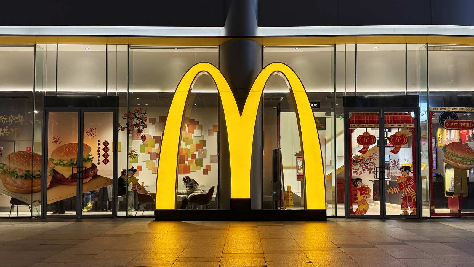
McDonald's operates over 42,000 locations worldwide, with about 95% franchised by independent owners. Many locations deviate from the classic yellow double arches, displaying alternative colors or single-arch designs. Reasons for variation include local government planning restrictions that discourage bright yellow signage and franchisee desires to preserve historic or context-sensitive aesthetics. Examples include an upscale black-and-white exterior near Rome's Spanish Steps with a gold "M" visible inside, and a teal-arched restaurant in Sedona that reflects local landscape concerns. Ten unconventional McDonald's restaurants are visually notable.
"It's no secret that McDonald's has taken over the world. Wherever you go, its double-arched "M" has become synonymous with Big Macs, Quarter Pounders, and temperamental ice cream machines. These golden arches are nothing if not iconic, which is why it's so noticeable when certain locations shrug them off. Yep. You heard that correctly; some restaurants reject the traditional McDonald's symbol."
"From bright blue arches to single arcs, there's more variety in the chain's locations than many realize. According to McDonald's, 95% of its businesses are franchises run by independent owners, so the motivations behind these outlying designs vary. Some locations are bound by planning restrictions from local governments, and ordered to avoid the visual pollution of harsh yellow lettering, while others simply wish to embrace aesthetics of bygone eras, like the single arches of the 1950s."
Read at Tasting Table
Unable to calculate read time
Collection
[
|
...
]