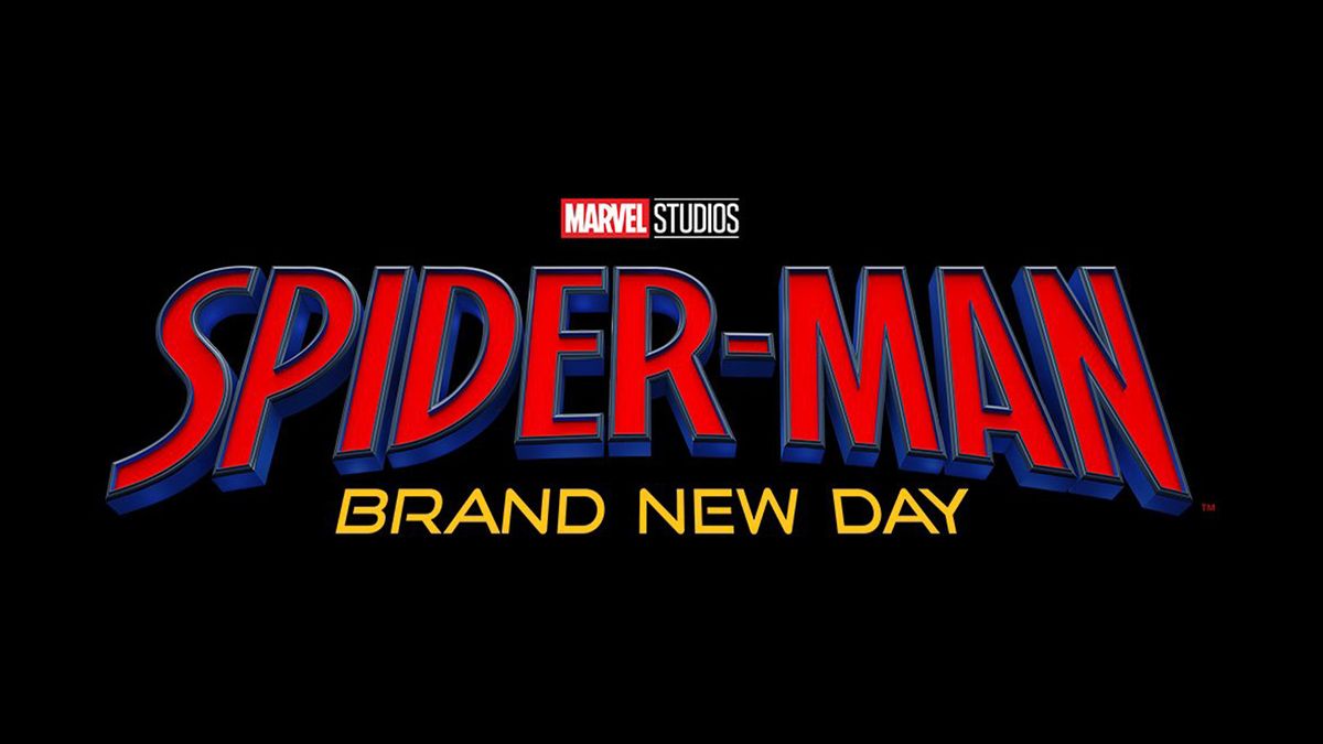
"The fact that they changed the font alone is so promising to their claims of it being a fresh start."
"My inner child is awake and he's so happy."
"Goddamn, I am already obsessed with this Spider-Man Logo choice. Love how energetic and bold it is."
Marvel's new logo for Spider-Man: Brand New Day has advanced excitement among fans as it represents a significant design shift while embodying a nostalgic element from the original comic logo. The redesign features bold typography in a classic red and blue palette, alongside a gold font for the subtitle, setting a fresh tone for the fourth installment of the Tom Holland film series. Fans express their enthusiasm, signaling a promising new direction for the franchise since its traditional roots are acknowledged with this innovative approach.
Read at Creative Bloq
Unable to calculate read time
Collection
[
|
...
]