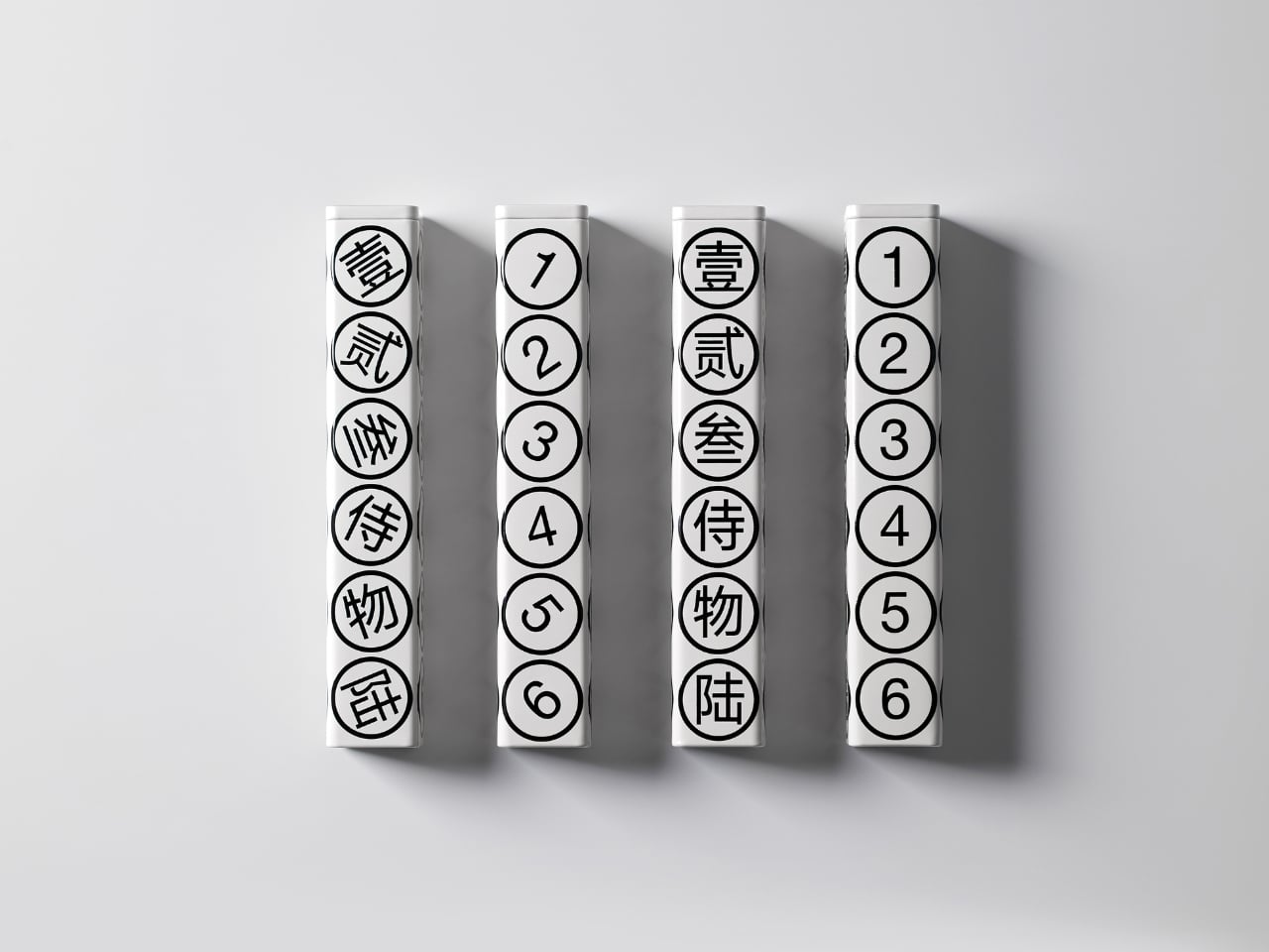
"What strikes me first is the restraint. The color palette is strictly monochrome, with black graphics on a pristine white background. No gradients, no metallic finishes, no desperate attempts to scream luxury through gold foiling or embossing. Instead, the design whispers sophistication through its geometric precision and typographic clarity. The circles containing each number create a rhythmic pattern down the length of the tube, making something as straightforward as counting feel deliberately composed."
"But here's where it gets interesting. The packaging doesn't just look good sitting on a shelf. According to the designers, a gentle shake brings the whole thing to life, making it playful and dynamic. Imagine holding this tube and feeling those tea pearls shift inside, each one rolling to match its designated number. It transforms a static object into something tactile and interactive, which is pretty rare in the tea world where most packaging is designed to sit pretty and do nothing else."
OneToTea packaging houses six white tea pearls inside a hexagonal tube with each face labeling a number from one to six in both Chinese characters and Arabic numerals. The design employs a strict monochrome palette and geometric, typographic restraint, avoiding metallic finishes and ornamentation. Circles around each numeral create a rhythmic visual sequence along the tube. The package becomes interactive when gently shaken, allowing pearls to roll and align with their numbered faces, producing tactile play. The bilingual labels combine cultural authenticity with universal readability, grounding the product in tea tradition while remaining accessible.
Read at Yanko Design - Modern Industrial Design News
Unable to calculate read time
Collection
[
|
...
]