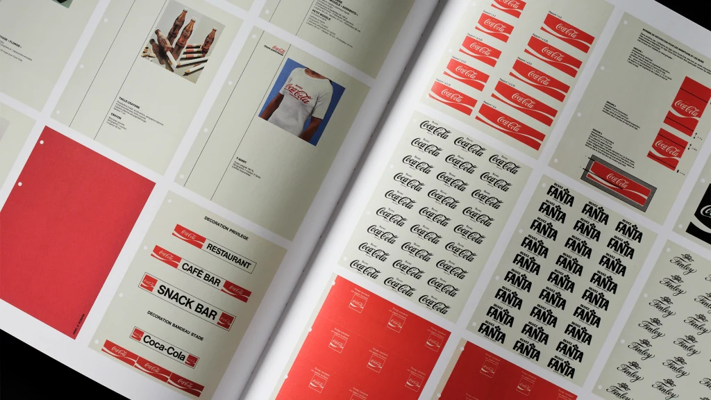
Project Arden was a significant overhaul initiated in 1969 to create a cohesive brand identity for Coca-Cola during its rapid growth. Spearheaded by Walter Margulies of Lippincott & Margulies, the project prioritized preserving essential brand features, like the iconic serif logo and bold red color. It produced the Arden Square visual system, which became a pivotal branding asset in Coca-Cola's history. The redesign recognized the importance of a unified corporate brand system, ensuring that Coca-Cola maintained its strong presence in the global market during an era of transformation.
"Project Arden was a design effort aimed at creating a cohesive corporate brand system for Coca-Cola during a time of exponential growth, focusing on preserving brand elements."
"The overhaul became a pivotal moment in the brand's history, with the establishment of the Arden Square visual system that would influence branding for years to come."
Read at Fast Company
Unable to calculate read time
Collection
[
|
...
]